WELCOME TO INITIAL DESCENT
Initial Descent was a digital art project designed to enable visitors to explore cultures virtually. Content included a mix of photography (focused on street art & signs), articles and vlogs covering various aspects of a particular culture.
While the overall project was not clearly focused around a particular goal, this post is to illustrate my design process around Initial Descent’s visual branding specifically, from logo/icon development to business cards. I worked alone on this project.
***
VISUAL REPRESENTATION OF CULTURE
A primary theme of the project was to represent cultures visually. One of the core content streams of the project was street graffiti and street signs—I was fascinated with the different types of signs and symbols across different cultures representing the same basic concepts.
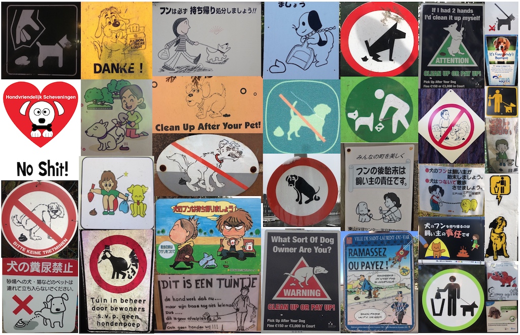
One of the artistic and commercial streams of the project was to make t-shirts out of graffiti and signs, using Illustrator and Photoshop to make a real-life image neatly screen printable. In order to differentiate these shirts from any random design, I wanted to make sure each had a sort of identifier specifying the origin of the graffiti or sign depicted. This thought heavily influenced my logo development.
***
BEHIND THE BRAND NAME
I specifically chose the Initial Descent name for my project based on semantics of travel and exploration. As a frequent flyer, my ears always perk up when the flight crew announces that “we have begun our initial descent into (name city).” I loved the sound of the term, and to me it represented the excitement when landing in a new place for the first time, when you peek out the window in anticipation of what awaits you on the ground.
Knowing some of what I wanted to do with the project, I also liked that the name conveniently shortened up to “ID,” or giving “identification” to a particular place and culture. And finally, there was the association with Freud’s id, or the part of our mind that manifests instinctive, unfiltered impulse.
***
A “LIVING” LOGO
As my branding was going to have to be flexible based on wanting to identify any range of different places and cultures, I toyed with the idea of a “living” logo that could be adapted. I will include sketches of the iterative logo design (and rejected ideas) at the end of this post, but for now I will jump ahead directly to the finished product:
![]()
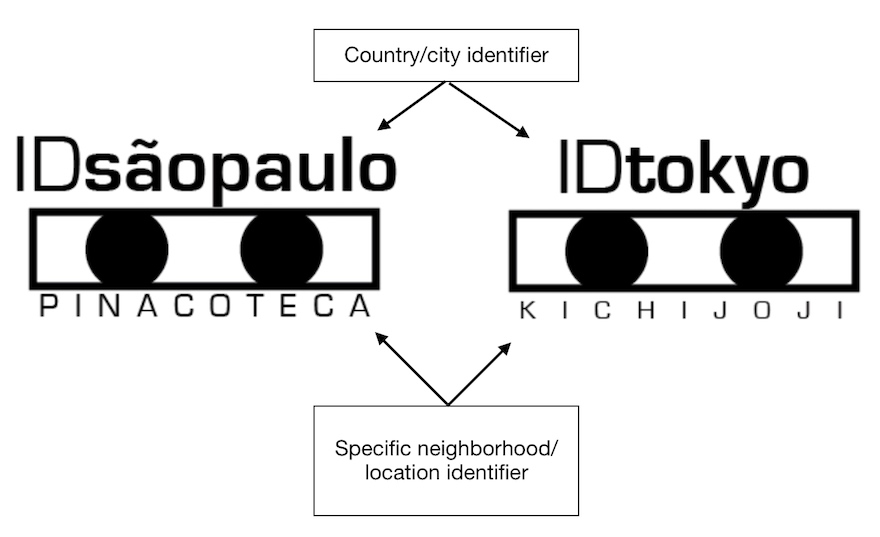
I wanted a rectangular shape logo so it would fit neatly onto the cuff of a shirt sleeve in a subtle manner. While simple, the basic shape represented two wide, curious eyes “peeking” into a place. The text would be adaptable to the use case, with the top line branding “ID” with a place (country or city), and the subtext specifying the particular neighborhood or street name the content came from.
This was all planned meticulously to reemphasize the concept that all content came from the place itself, not simply from the designer’s imagination.
***
EXTENDING THE VISUAL CONCEPT
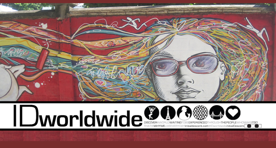
As the primary medium of Initial Descent was a website, and visual representation of culture was a central theme, I wanted to incorporate visual cues as much as possible into the website design. All content was divided into country pages, separate ones for each country represented, and able to be cross-referenced by category type as well.
Posts were tagged with visual icons to identify the content category type. Each country page featured a header image capturing some element of that culture, with a branded banner overtop featuring the country name and six icons that represented the culture.
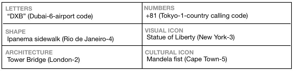
I decided on six category types—different broad level visual concepts for representing a culture, as follows:
- Letters: perhaps the most obvious choice, as letters are visual and have meaning
- Shapes: a shape of particular meaning to identify the place/culture
- Architecture: a prominent piece of architecture in the place
- Numbers: similar concept to letters but numerical
- Visual icon: a famous icon of the place/culture
- Cultural icon: something very specific to the culture
![]()
You could argue that some of these overlap, but I wanted to have some creative leeway so I could apply the concept across any place and culture. The number of icons also fit conveniently into my basic page layout without appearing too cluttered.
***
BLACK & WHITE BY DESIGN
One thing that stands out about the ID branding is the absence of color. I wanted to do a black-and-white scheme specifically to avoid taking away from the colorful imagery that was central to the project. I felt that incorporating color into the logo would conflict with the images the logo would be paired with, and also take something away from the iconic symbolism.
***
DESIGNING FOR IMPACT
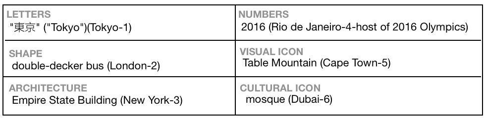
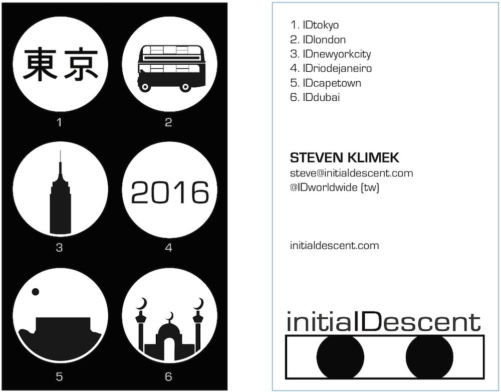
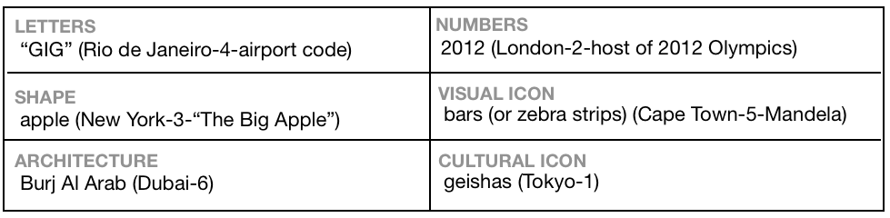
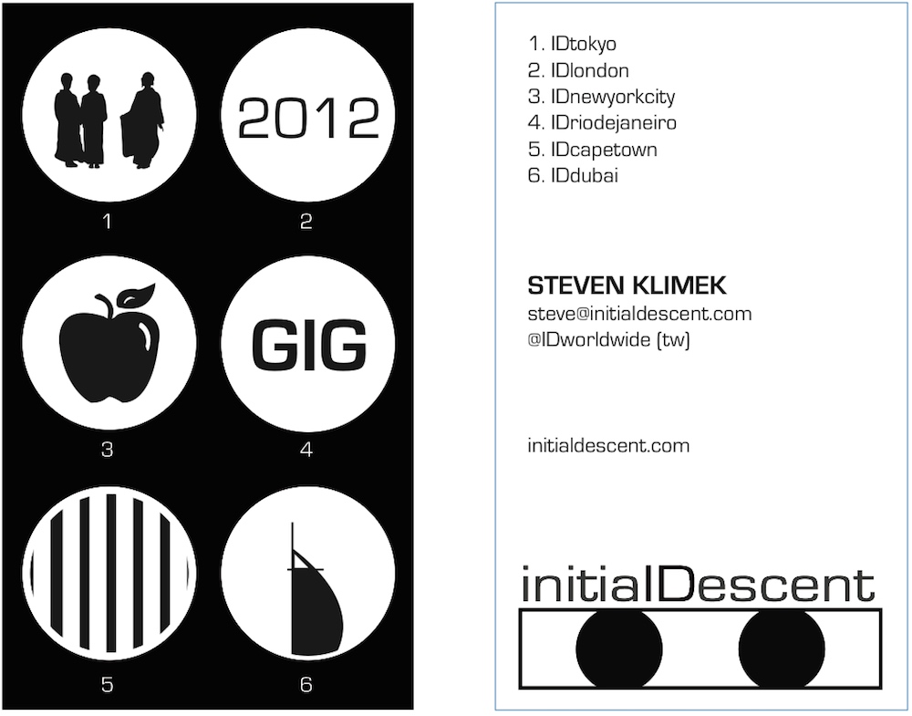
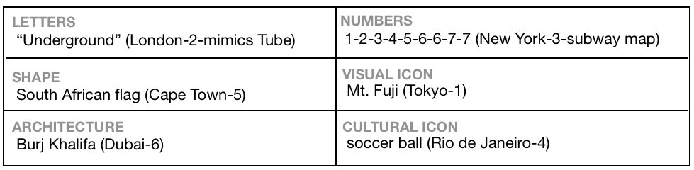
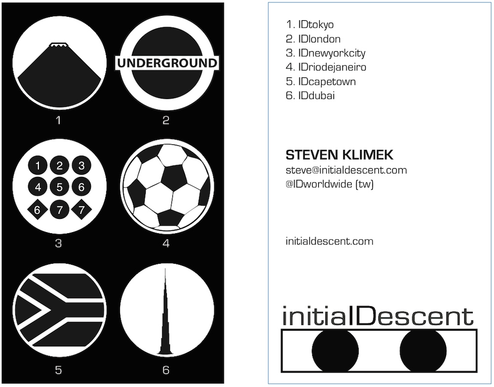
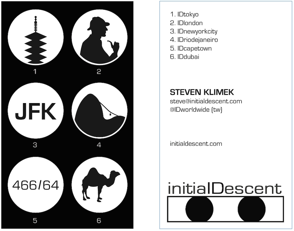
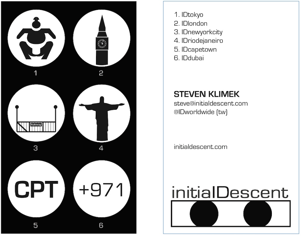
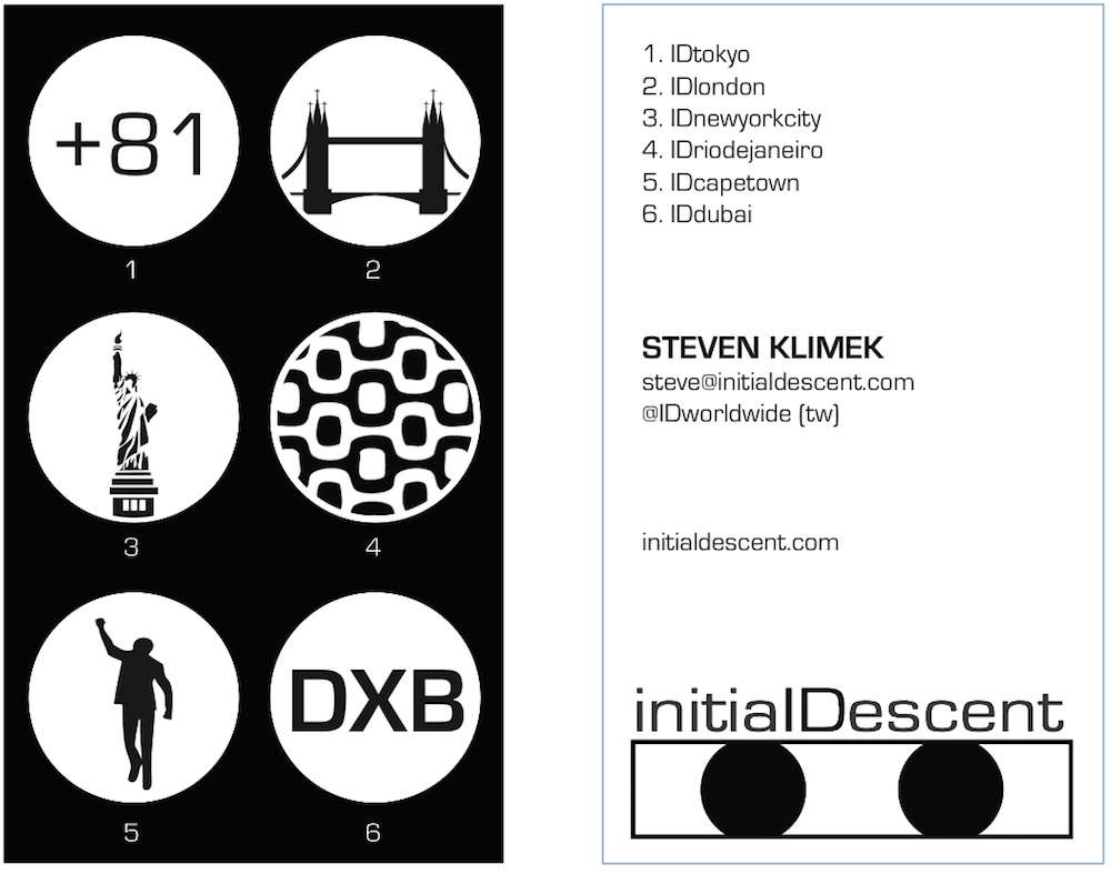
I wanted to design a creative business card that was highly visual, memorable, and would communicate to the recipient that the site (InitialDescent.com) is truly global. As the Initial Descent concept was built on visual representations of cultures (street art, graffiti and signs), I wanted to incorporate this into the business card design. My business cards and marketing materials were designed with the goal of demonstrating that there are multiple ways to represent any particular culture, and the way that people perceive a culture will always vary person to person. I also wanted them to be fun and playful, with elements of a game.
I chose six icons based on my category types explained above, and what would neatly fit on a standard card. I then chose six cities (not more than one on any continent, with the idea that each time I make new cards I will change the cities—e.g. swap out London for Paris or New York for San Francisco), and produced one of each visual category to represent that city. Finally, I placed them all on six versions of the business card, with each card featuring one of each city and one of each visual representation category.
This achieved my goal of making it playful (can you figure out what each icon represents?), and when I would distribute them I would often give the person a choice of which card they wanted (or have them pick randomly as though pulling a card from a magician).
INITIAL DESCENT BUSINESS CARDS (Ver. 1)
CARD 1A
CARD 1B
CARD 1C
CARD 1D
CARD 1E
CARD 1F
***
BACK TO THE LOGO
I wanted to get through the full extension of my branding/visual design concept relatively succinctly, but as promised earlier, now I will come back to the full development of the original Initial Descent logo.
In addition to having a “living” logo in the sense that the text could change, I also wanted to create a structure flexible enough to lend itself to future co-branding opportunities. In other words, I wanted the two eyes in a box concept to be alive and fluid.
This means that it could, in theory, be applied to any kinds of “eyes”—any eyes with a rectangular shape over it could be a depiction of the Initial Descent branding. It also means that emotion or variation could be incorporated into the logo, to be specifically customized for the content accompanying the logo (e.g. something specifically applicable for a gender or conjuring a specific emotion). Below are some logo concept ideas incorporating (L-R) emotion, gender and extra emphasis on branding:
![]()
The flexible logo concept would lend itself to cobranding opportunities with famous characters (not used with permission–just sketch examples for my imagination), like these:
![]()
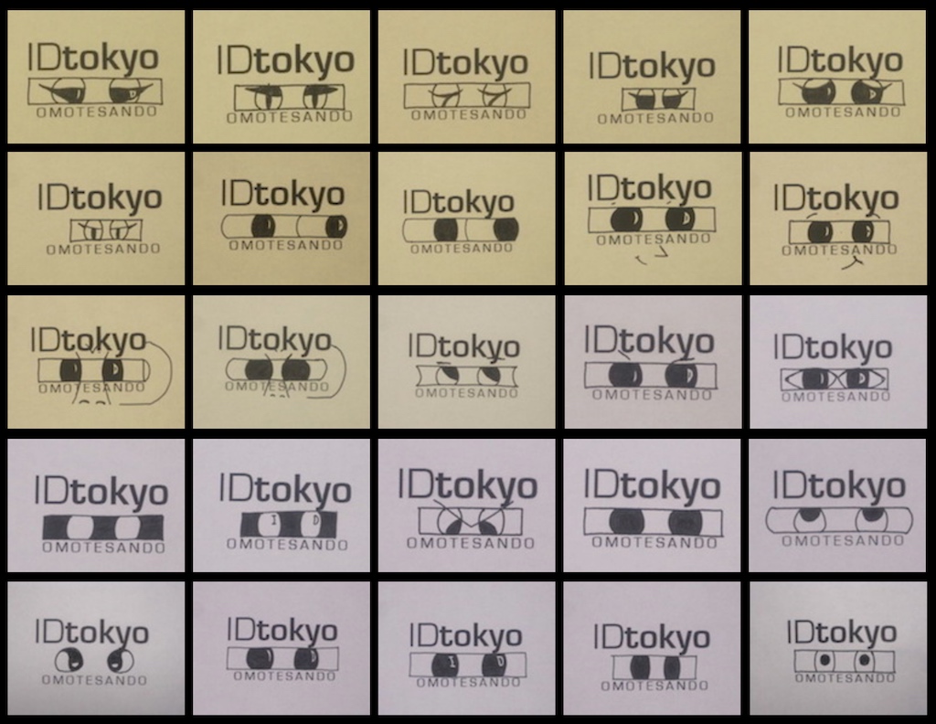
Early ideas included a camera to emphasize the visual focus of the content, which evolved into the much simpler logo concept I launched with.
Please see some of my creative brainstorming below.
![]()
![]()
**
ADDITIONAL RESOURCES
If you wish to learn more about the Initial Descent project, please check out the following:
- initialdescent.com (full website)
- “Welcome to Initial Descent” (video)