REDEFINING “SOCIAL” IN ONLINE MEDIA
For all of the possibilities for connection that social media have created, every major platform works essentially the same way. As we put our lives out there for the world to see, we are subjected to an unending stream of judgment: likes, hearts, follows, swipes and whatever other forms approval come in.
My cofounder and I set out to redesign interactive social media, specifically to eliminate all forms of judgment in feedback loops in search of authenticity.
***
EXECUTIVE SUMMARY
Sideview was an ambitious project to redesign the fundamental feedback structure in a social media app. We aimed to address the growth trend of mental health issues prevalent today by creating a structure for self-validation (as opposed to validation from others) that was still engaging and interactive.
This case study summarizes the design and development process, from concept through launch. We achieved an invitation to Web Summit’s Alpha program, the endorsement of some of the world’s top psychology minds and had encouraging usage patters from our early users, but ultimately failed to secure sustainable funding.
I still believe strongly in our concept and the utility of what we built. However, I think we made some missteps in choosing a business model that would get us through launch. Our concept by nature was more complicated than traditional social media, and achieving the hockey stick growth required to be able to monetize a free app requires extreme simplicity. In hindsight, we would have either had to target a specific user with a subscription model, or find a way to simplify our product more than we were able to without compromising our purpose.
***
INTRODUCTION
I met Paul Bulencea, a Master’s student at Salzburg University
of Applied Sciences, at London’s World Travel Market in
2013. Paul was giving a talk about his master’s thesis– innovation in tourism–specifically leveraging experience design methodologies. At the time, I was working on a cultural content project that lacked a clear focus, and was intrigued by the experiment Paul had conducted at a beer museum in Salzburg.
We exchanged ideas after his presentation, and before you know it, we were thinking about all of the problems we had with huge travel review sites like TripAdvisor. Our first goal was to come up with a way to make sure the recommendations we used while traveling were more “organic.” The four days we had each planned to stay in London became three weeks.
***
MY ROLE
Sideview was conceived in October 2013, launched in 2014 and our team remained fully invested until we shut down in 2015.
Paul and I were both very close to all aspects of the design process. I took primary responsibility for concept development, visual design and brand (including marketing content), while he focused primarily on research and testing.
***
THE CHALLENGE (PART I)
FACILITATING AUTHENTICITY
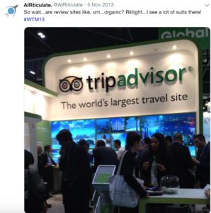
Both frequent travelers, Paul & myself were frustrated with channel bias in travel recommendation sites.
At WTM, it was obvious what a huge commercial operation sites like TripAdvisor were (with businesses paying for placement under cover of “user” reviews), which we naively thought were full of real peoples’ true experiences. As such, we sought out to create a way to protect against these biases.
In our creative brainstorms, we kept circling back on two ideas that became foundational to our project: hashtags (to find information) & anonymity (to enable honesty). Of course these concepts introduced their own new challenges. As any keyword marketer understands, hashtags are too fragmented, as at WTM I was annoyed by having to search multiple variations (e.g. #WorldTravelMarket, #WTM, #WTMLondon, #WTM(year)) in search of relevant content. And anonymous social media platforms were notoriously plagued with perverts and trolls.
***
THE APPROACH
DESIGNING VISUALLY
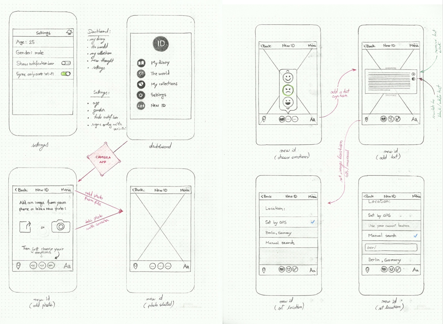
To address our first challenge, I was able to draw from the work I had done previously for Initial Descent. As part of the visual design concept for that project, I had developed a series of visual icons that served to identify both cultures & types of content. This provided a convenient way for us to solve the problem of fragmentation–allowing users to select & search hashtags from a menu by choosing visual icons.
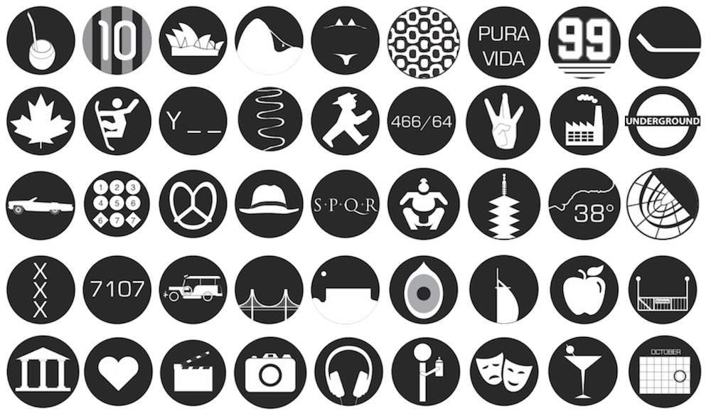
These were some visual hashtags from the Initial Descent project, which served as inspiration. The bottom layer represents types of content, while the others represent physical places (bonus points if you can figure them all out!)
As we wanted user feedback quickly, we already at this stage began discussing our conceptual backbone with potential users (in this case, people we identified as frequent travelers). These initial conversations made it clear to us that we could incorporate emotions into our visual hashtag concept to connect on a sensory, rather than just informational, level.
As we continued to flesh out ideas with our early collaborators, we saw that the emotions became a focal point of interest. Once we got into prototyping more detailed concepts, it was clear that while travel was our initial goal, it was not a requirement for using what we were building. It seemed that we were building a more general social network founded on honesty, anonymity and emotion.
***
THE (FIRST) PIVOT
PSYCHOLOGY 101
We did not have any doctors of psychology in our team, which meant we had to understand the psychological aspects of social media as deeply as possible. We read as many journals, articles and studies as we could get our hands on, collaborated and shared learnings and went to great lengths to understand users (at this stage primarily our personal networks) as well.
Throughout the project we conducted ethnographic research and used participatory design methods. This approach was necessary to understand how users interacted with our app and what impressions it left them with.
DEEP IN THE RESEARCH
To address our Anonymity challenge, we spent a lot of time buried in research & literature, such as this Stanford University study about negative feedback loops. We learned that anonymity changes people’s behavior, which explains why Internet comments typically morph from bad to worse. We believed that anonymity would promote honesty (if you can’t collect “hearts” and followers, what would be the purpose of posting false content?), but both things could be true.
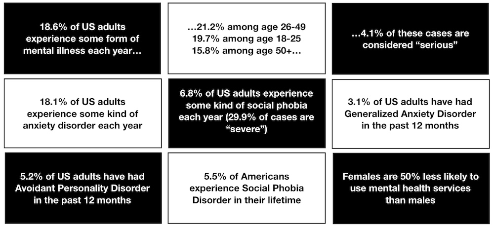
We also saw that mental health was becoming an increasingly prevalent problem, evidenced in some of the following statistics that we used as inspiration:
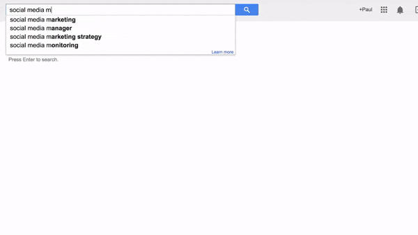
There was also a significant amount of research on how social media has impacted our collective psychological health. Nothing summarized that point better than simply typing the words “social media” into a google search box and seeing what automated suggestions came up (based on frequency of search):
***
THE DISCOVERY
REDESIGNING FEEDBACK
Our iterative approach to this point made us question whether the feedback loops that exist in nearly every social platform were helping to cause some of the negative psychological impact in social media and, by extension, society. In nearly every case, feedback comes as some form of peer approval, someone validating your idea or not.
But of course without feedback at all there is no “social”—it’s simply a static diary like your phone’s notes app.
By building standardized connection points into a social network, in this case in the form of visual hashtags, we found a way to generate real feedback that had nothing to do with “judgment” validation.
***
THE VISION
THE SOCIAL NETWORK FOR PSYCHOLOGICAL HEALTH
Our vision was to create a social journaling network that aimed to bring back the emotional benefits of keeping an honest, unfiltered diary while incorporating a safe engagement loop.
We agreed on the following core principles:
- To empower and encourage people to find deeper meaning through documenting their experiences;
- To promote understanding by allowing people to share their personal moments and thoughts and observe those of others;
- To improve mental and emotional healthy by incorporating the laws of psychological fulfillment into social networking structures;
- To assist people in finding satisfaction and validation in who they truly are.
As the scope of what we set out to build was so undefined, and we had few firm metrics to make development decisions with, it was also important to align around a set of belief statements.
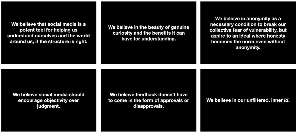
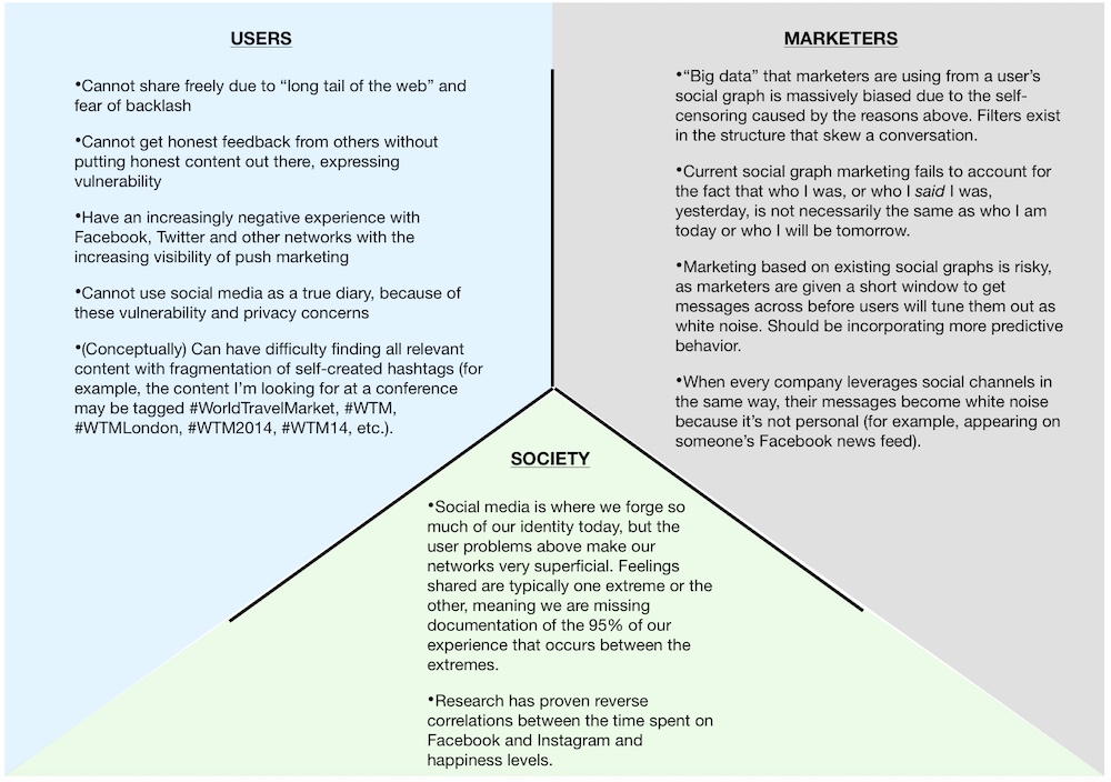
The third part of this exercise, in the same vein, was to agree upon a set of problem statements that we were designing a solution for. While user problems were our primary focus, I knew it would be important to understand how we were benefiting secondary stakeholders as well: marketers (who would be necessary to our long-term viability) and society in general (as we truly believed in the cause we were committing to).
***
DEFINING OUR TARGET USER
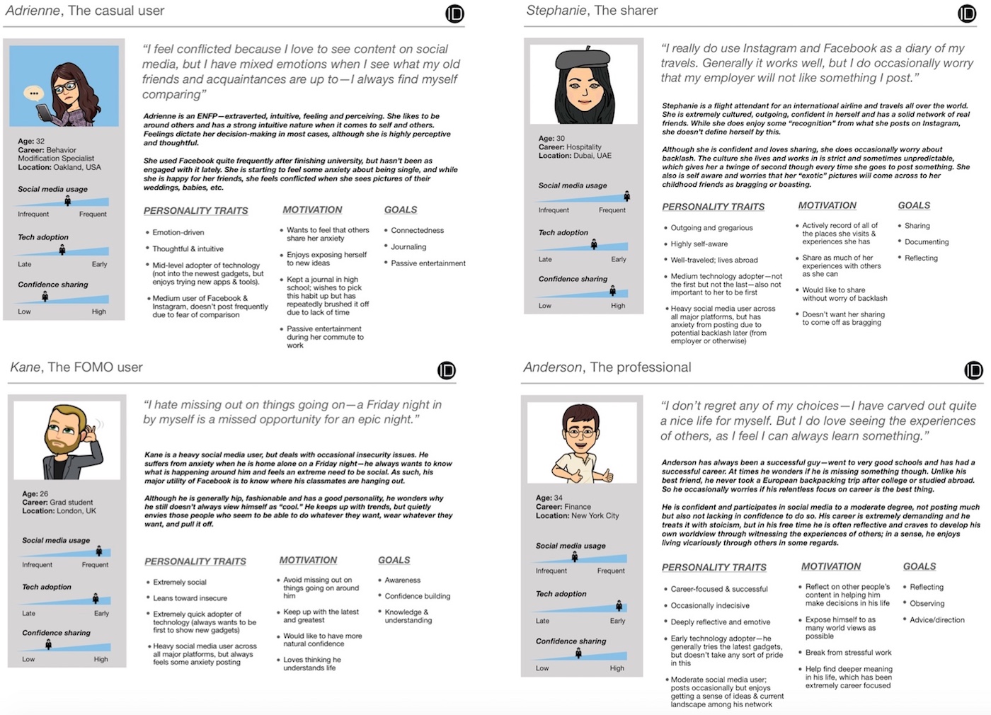
By this point we had evolved from solving a travel-specific problem into a broader scope, which is always a dangerous proposition in design. In order to maintain focus on the specific people we wanted to solve problems for, we created a series of personas that represented ideal users for us, modeled off of actual individuals who were part of our research group. We continuously engaged these personas in evaluating every design decision we made throughout the life of the project.
***
THE REQUIREMENTS
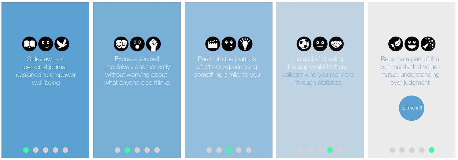
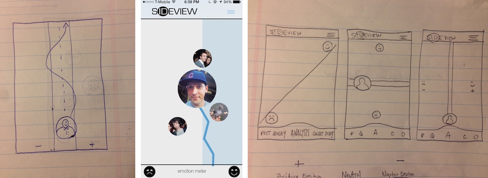
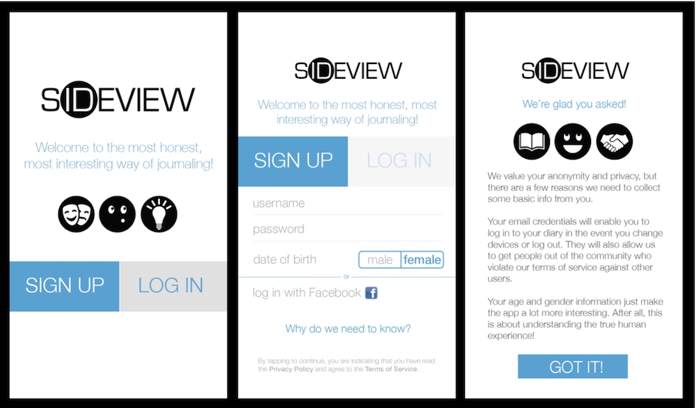
LARGE DREAMS, LASER FOCUS
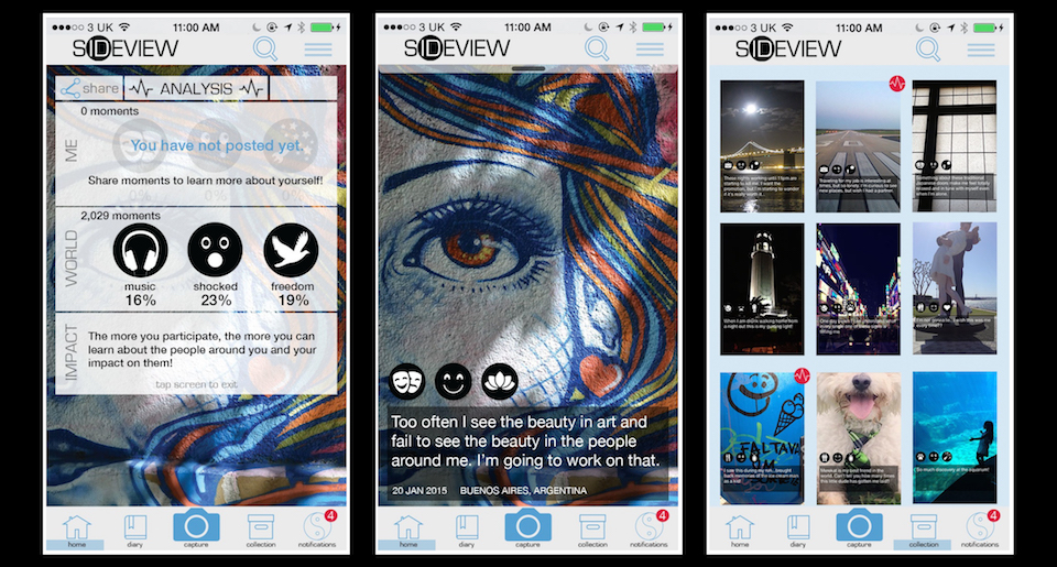
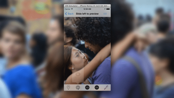
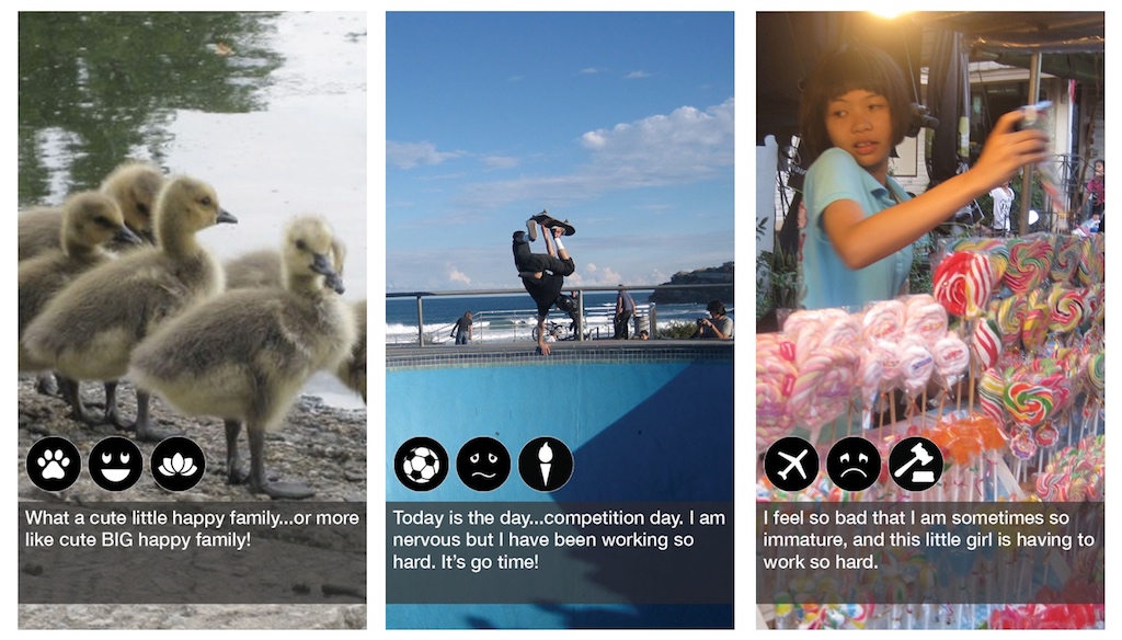
Although we aimed to create a social network that everyone could participate in, we initially had a hard time agreeing on specific focus areas. The basic premise was going to be simple: post an image, tag with visual hashtags, add free text, and share. No profiles, no “likes” or follows or upvotes, and completely anonymous. The feedback loop would be that, after you post, you are then shown posts from other anonymous users with the same hashtag combination as yours.
There was a structure to the hashtags as well, in order:
- Activity: describes your post by an activity category
- Basic emotion: primal emotion felt
- Secondary emotion: more complex emotion felt
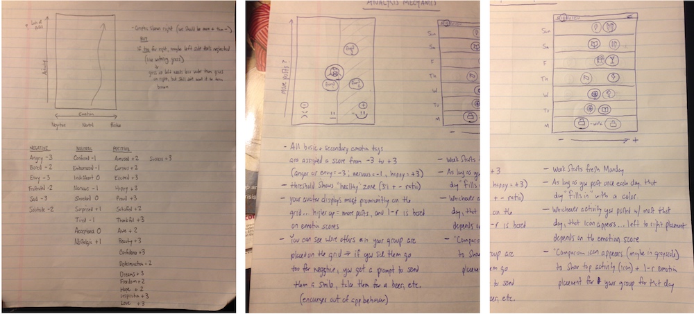
The design process in choosing a full range of emotions (without providing too many choices) was collaborative amongst our team and a small beta group of users, relying primarily on a think aloud technique and incorporating hierarchical card sorting for more granular decisions (such as choosing what symbol to use for a particular emotion). We went back and forth grouping words together to try to reach the minimum number that would cover the broadest range of activities and emotions as possible. We rolled out with the following:
***
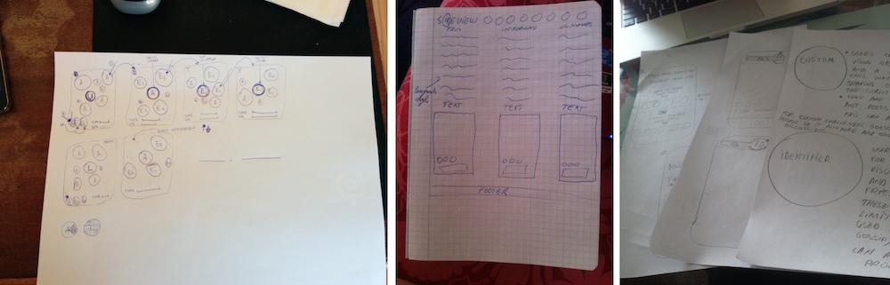
DESIGNING THE INTERACTION
Once we had our icons set, we had to design the basic interaction. This involved extensive wireframing (sketched onto flash cards) that we presented to our beta group. These sessions informed the interactivity we would build into the app.
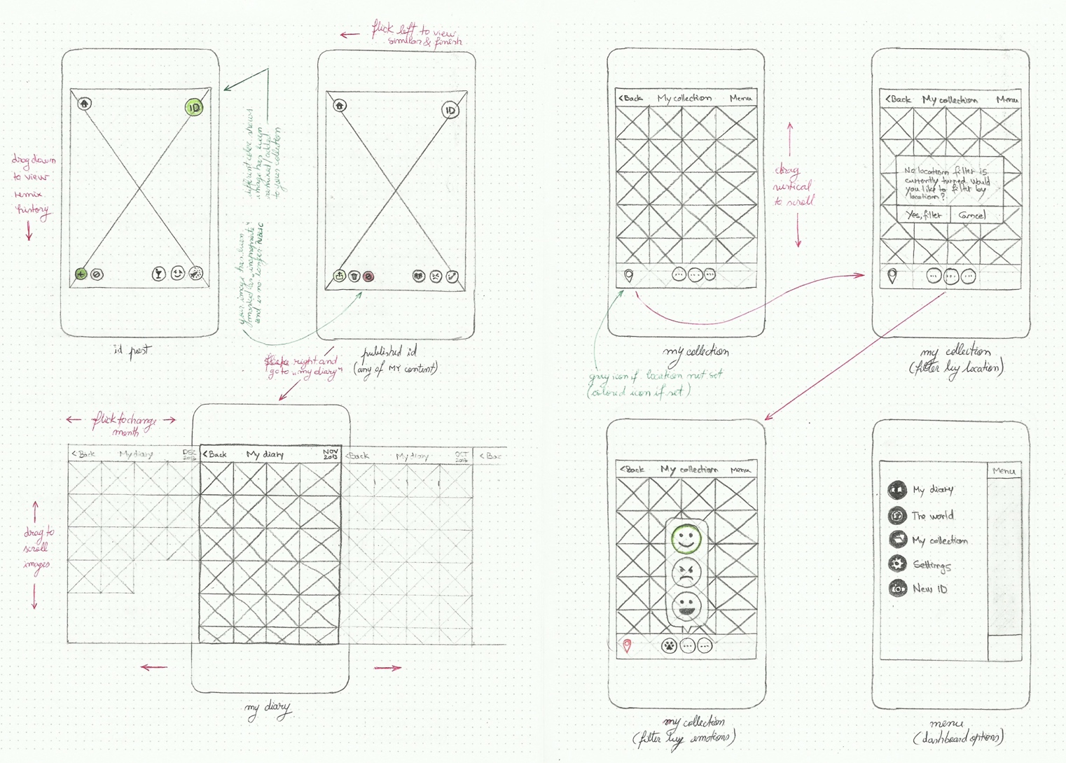
Ultimately, we ended up with a post-and-feedback experience that served as the core of the app’s functionality. The idea would be that the app would give feedback in the form of statistics on how many other people were feeling similar things (for a sense of belonging), and giving you the option to view some of those posts tagged the same way.
***
VEERING OFF COURSE
It was after our primary interaction piece was designed that our focus started to fragment. By this point, Paul & I had picked up a third founding partner to handle development, as neither of us were coders. The more opinions we got in the room, the tougher it became to remain aligned. The vision, belief and problem statements we had previously defined helped, but we started to have conflicting ideas on the best way to achieve our goals.
In hindsight, it was at this point that we should have launched our beta. We already had an MVP heavily informed by and co-created with a group of our target users, and should have gotten the live product into their hands (rather, mobile phones) as quickly as possible. However, at the time we felt that we would need a stronger value proposition to ensure stickiness. While it’s hard to say how critical of a mistake this would prove to be, it was a valuable learning for each of us to take with us into our future projects.
EVALUATING THE OPTIONS
As our core principles included encouraging documentation, promoting understanding and self-validation, we felt we needed an impactful design solution to achieve this. We also kept coming back to this societal problem statement with other social media platforms, where inspiration for posts tends to come from very positive or interesting experiences (e.g. “my amazing weekend at the best club in Vegas!”) or very negative ones (e.g. “United’s customer service is the WORST!!!”):
Feelings shared are typically one extreme or the other, meaning that we miss documenting the 95% of our experience that occurs between the extremes.
To encourage the journaling and sharing of this 95%, we had to make sure the feedback loops were incentivizing enough to encourage it. Among other ideas, we experimented with the idea of having daily targets, but wanted to feedback from the world to be engaging enough on its own.
***
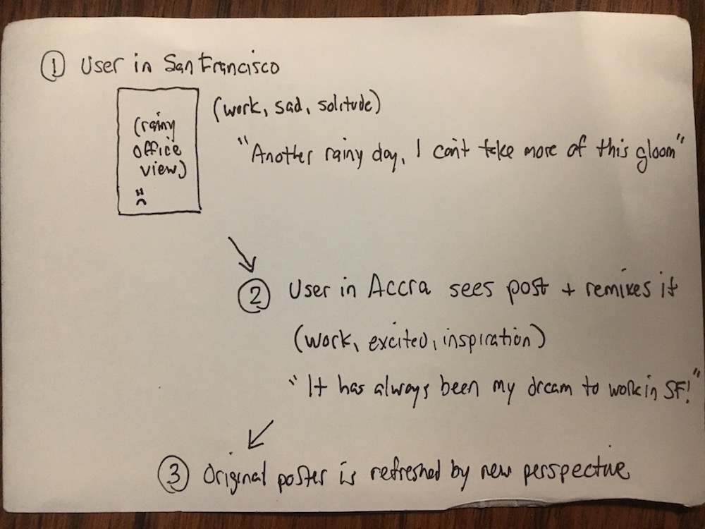
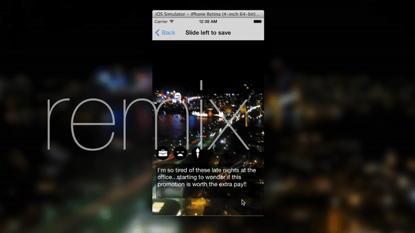
INTRODUCING “REMIX”
One of our strongest ideas was a concept we called Remix, where content that you posted would be up for reinterpretation by the community. The basic idea was that after you post something and tag it accordingly, others who view that post (image + text combination) would be able to apply their own tags to it. In theory, this was designed to give the original poster a fresh perspective on their experiences.
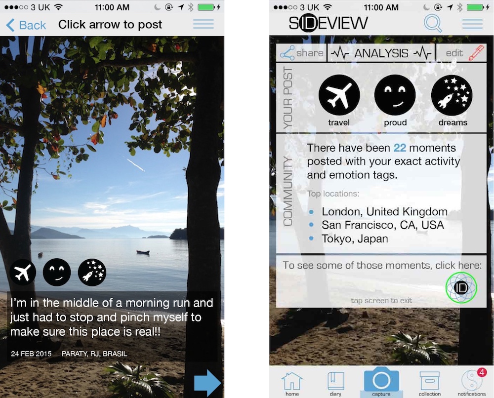
INTRODUCING ANALYSIS
Another way to make a non judgment-driven feedback loop stronger was to allow users to have basic analytical data of their activities and emotions. Because every post was tagged with a location, an activity and two emotions, it enabled us to present statistical correlations of those data points to the user, which could also be time-bound to better understand complex emotions. So the following type of insight was possible:
“Over the past 3 months, 75% of the time you are posting about work in San Francisco, you feel frustrated.”
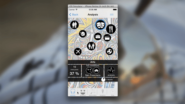
Whether or not this kind of insight was useful to users remained to be seen, but it was a form of feedback not offered anywhere else. In the longer term, as our user base grew, we also envisioned being able to do comparisons with this data based on location, gender and age. This would allow users to be able to “compare” against others not on a jealousy-inducing individual level, but on a broad level to see where they stood emotionally in comparison to their comparison group.
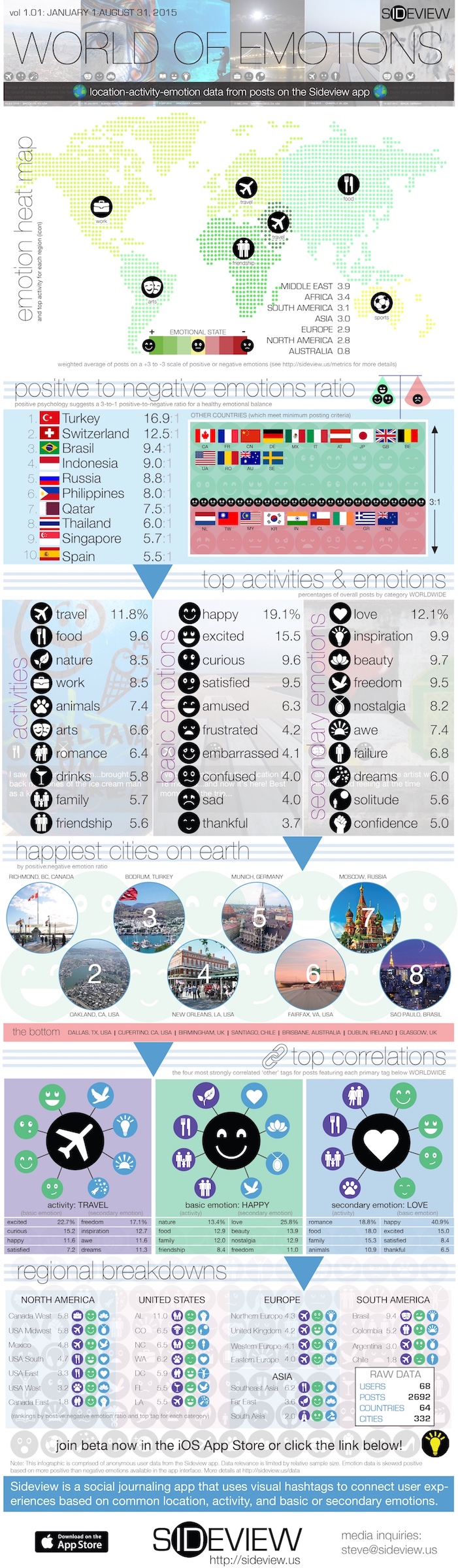
Not to mention that, if it worked, it would also open the door to amazing infographics about the emotional state of the world, like this mockup:
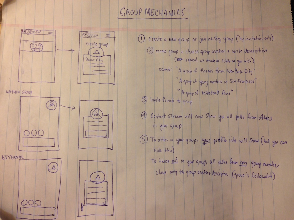
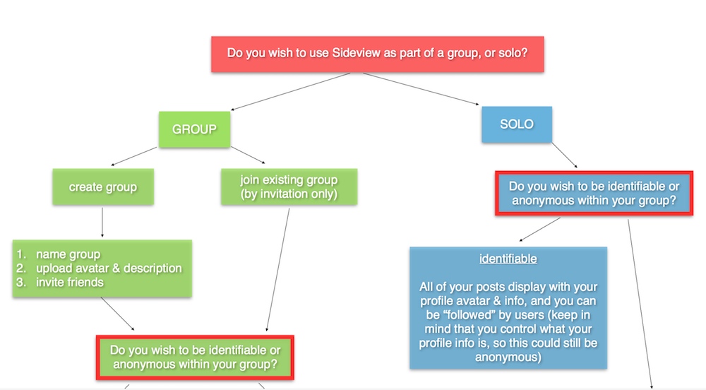
INTRODUCING GROUPS
In order to make our concept more interactive, we also explored the concept of groups. This was a point of contention among us, as it would require some form of identification, and we debated whether the mere thought of this would diminish trust among our core users.
We explored the concept in two ways. Our first method was to allow others to view your profile via invitation. Ideally, we envisioned this to become small friendship groups (not individually one-on-one) whereby group members could keep tabs on the emotional state of others in the group. Each emotion was to be assigned a score from -3 to +3 (with anger, for example, being a -3 and happy being a +3), which would result in a cumulative level of happiness. Group members could see where each other member was at any given time, and then know (in the ideal world) to check on someone if they were in a negative space.
The other approach was a concept of semi-anonymous groups. In this case, groups could be created and users could be identifiable within their groups (and remain anonymous to users outside of their groups).
***
THE CONSTRUCT IS THE OUTCOME
While these group options would solve our worry about engagement, we also dismissed them fairly quickly on the grounds that they would enable edge cases that would violate our core principles. In many cases, the construct of design itself creates the outcome.
I remember seeing an advertisement for another anonymous app, Whisper, that billed their platform as non-judgmental, stating that there was no way to “dislike” or “downvote” content. However, they did have a “like”, which in and of itself creates an opportunity for perceived rejection (if you know a “like” button exists and you don’t get liked, you will take that as a rejection even in the absence of an explicit “dislike”). In that case, the design decision created the outcome.
In our case, we knew that opening similar avenues could contradict the foundation we were trying to build around trust and safety to express. Imagine a scenario where an “invite” feature is introduced, and you were frequently journaling about your significant other (which is a very common use case). If s/he knows that the new feature exists, and then asks you for an invitation to your journal, that automatically compromises your comfort level; if you oblige, you are sharing content uncomfortably, while if you decline, you are straining the relationship (“what do you have to hide from me?”).
***
PRIORITIZING OUR WAY FORWARD
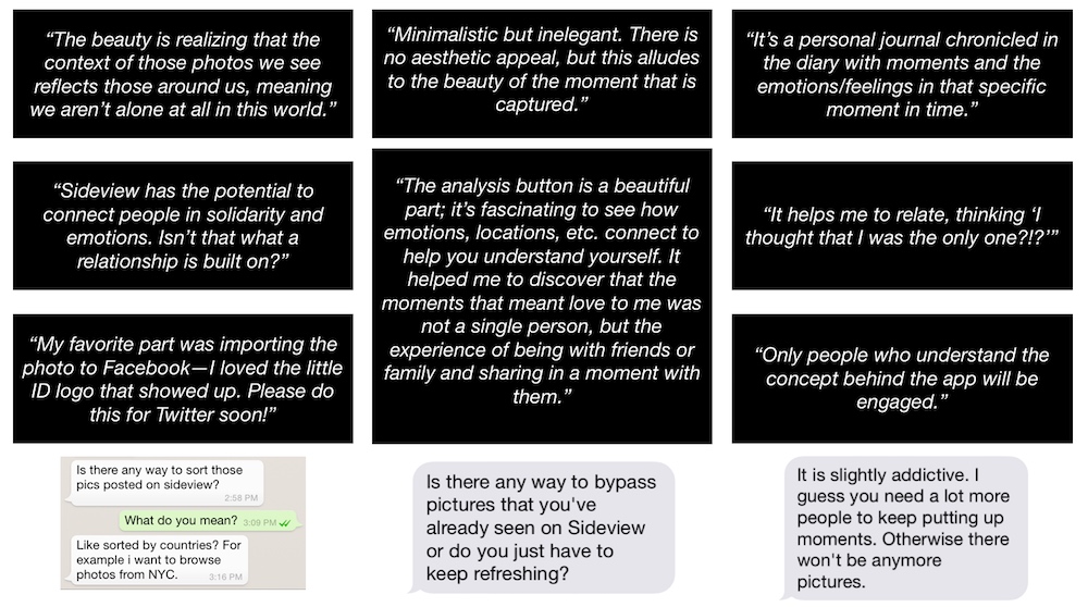
While our group concepts were fairly easy to dismiss, we still had to decide between Analysis and Remix, sending us back into a research phase. By subjecting both potential features to our persona group and also doing concept testing with our research group using mockups we created with Proto.io, it became clear that Analysis would be the more useful feature. It also became clear that it was much more easily understood by our subjects, whereas Remix required several rounds of explanation in some cases.
***
THE LAUNCH
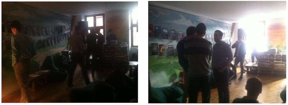
In October of 2014, we finally launched Sideview for iOS. We accompanied the launch with a series of organic social media marketing, creating videos and visual content (actual posts from our app) and sharing them across various social channels.
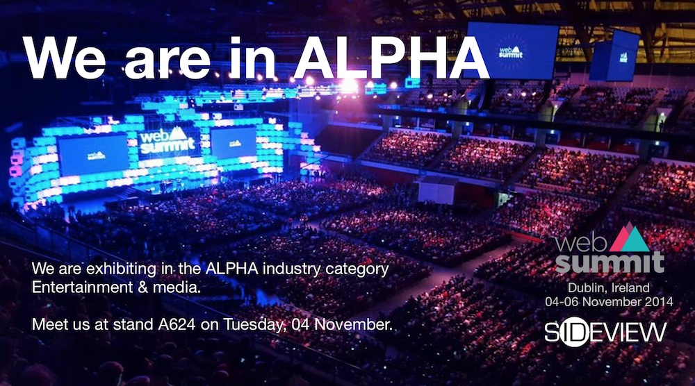
We were also accepted into WebSummit’s Alpha program in Dublin in November of that year.
Early in 2015, Sideview usage peaked around at around 400 daily active users and about 2600 monthly active users. While our stickiness metrics were strong—people in the app were using it often and for long session lengths—we failed to crack the user acquisition hurdle. After failing to secure sustainable funding, we moved on to other projects by the end of that year.
***
LEARNING FROM FAILURE
Paul & I have subsequently reflected back on our Sideview experience in awe at how little we really knew going in. We became completely consumed by an idea we were passionate about, and we leveraged design principles to co-create a product we believed would impact the world for good. But there were several other areas that, while they may be obvious now, we overlooked at the time.
LESS IS MORE
As mentioned earlier, our hardest learning was that we should have gone to market as quickly as possible to truly let users decide the direction of the app. While we went to great lengths to conduct various types of research, none of it was as effective as having more and more real users active. So if we were starting again, we would launch as soon as we had the first phase complete (basic post-feedback interaction).
THE KISS PRINCIPLE
Reflecting back, we realized that we were never able to simplify our concept to the level necessary for mass adoption. Our app was intended for a somewhat mature audience by design, but it is still critical to be able to clearly articulate a value proposition within a few seconds, which we were not able to do.
LOOSENING THE GRIP
Speaking with other entrepreneurs after we ended the project made clear to us that we had hit a common pitfall—becoming too close to a product when it’s “your” baby that you are unable to detach from our own ideas enough to build something users want. I thought I was prepared for this, but looking back I can see many opportunities to detach more than I did, which would have yielded better results.
MARKETING MATTERS
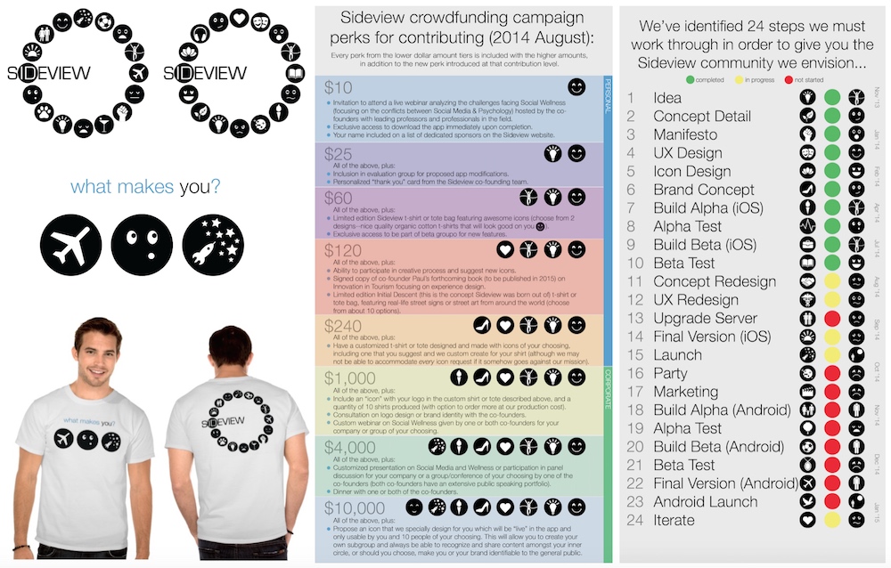
We were so focused on building the product that we didn’t give enough attention to user acquisition. We did very little formal marketing other than posting content across various social platforms, and didn’t make enough of an effort to connect with advocates and influencers, develop strategic partnerships and raise capital. We ran a crowdfunding campaign–but did so too late in the process–which ultimately fell short of its goal.
I will include links to all of our marketing content at the end of this case.
FOCUS IS HARD
Despite our efforts to solve a problem for a niche audience, we still got caught chasing too broad of a scope at times. We elected to pursue an advertising monetization model, whereby we could monetize user data. However, we never grew to a point where this data was valuable.
Our commercial value proposition was the following: with most digital marketing, I am served advertisements based on explicit inputs I made, and will often be served advertisements about an item well after I had already done/purchased/experienced it. Our platform, in theory, allowed us to be more predictive—you may not mention “Bali” anywhere, but we can see that this user frequently posts far away from home, is happy in warm weather and loves watersports. So even though you may not have mentioned it, you may be the perfect target for an airline’s special Bali fares.
SOLVE ONE USER’S PROBLEM
Looking back, we likely would have been more successful if we had focused on a particular niche market (e.g. the mental health community, educational communities where bullying exists, etc.) and tried to monetize sooner. As we believed we created a forum for honest content, perhaps we could have made the app available on a subscription model (and sold these subscriptions to universities who could offer it to all incoming students, for example).
***
WHAT’S NEXT?
At the time of this writing (~3 years later), Paul & myself have moved on to other projects. Both of us still believe in our concept and believe there will be a game-changing shakeup of mainstream social media at some point, especially as mental health remains such a prevalent societal problem. Perhaps we can leverage our learnings from this writeup and take another crack at it…
***
RESOURCES
- Sideview website (includes links to the below)
- What Social Networks Want (marketing whitepaper)
- Sideview demo video (how the app works)
- “Place to Belong” Sideview brand/concept video
- “No Evil in the World” Sideview brand/concept video (crowdfunding campaign)