AN AIRPORT BEFITTING OF ITS STATURE
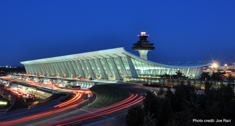
Built in 1962 as one of the signature creations of famed architect Eero Saarinen, Washington Dulles International Airport is the largest in the National Capitol area. In 2013, a series of poor management decisions had IAD facing a decline in passengers.
I worked on a project to help improve customer experience at the primary international gateway for the mid-Atlantic region.
Please note, I have omitted or altered confidential information in this case study. All information is my own and does not reflect the views of Metropolitan Washington Airports Authority.
***
EXECUTIVE SUMMARY
This case study looks at how we leveraged service design principles to improve the passenger experience at Dulles Airport. Despite significant financial investment and increased capacity, passenger use had decreased in five of the previous six years, in large part due to hassles that airport design decisions created.
Our initial research showed that the airport’s previous reliance on “satisfaction” scores did not accurately portray customer feelings. There were too many unintuitive design decisions (such as random assignment of security lines) that compounded frustrations in an already-stressful environment. We developed a set of key metrics based on insights from more than 200 passenger interviews and then developed a concept of what a future perfect state would look like. From there, we ran a series of concept tests for things like the security procedure and tweaked our ideas based on iterative feedback.
We ultimately presented a series of recommendations to eliminate randomness from processes, optimize existing infrastructure to reduce hassle, and better manage passenger expectations. In the three months after implementation, we saw security wait times decrease by 11%, randomness decreased by 44%, preventable missed flights decrease by 23% and improved social sentiment. More importantly, passenger traffic has increased each year since (even adjusted for capacity changes).
***
BACKGROUND
Having grown up a stone’s throw from Dulles watching the likes of the Concorde and the space shuttle land there, I want to love the place. Amidst my world travels, the airport symbolizes my ultimate comfort zone—my hometown, my childhood and the countless memories associated with them. By 2013, I had simply run out of excuses for the stressful experience flying via IAD had become.
Having spent more than USD$4 billion on improvements in the previous decade, the airport still proved to be one of the least intuitive on earth. I wasn’t alone in this viewpoint: passengers had decreased in five of the previous six years despite increased capacity with the arrival of heavyweights like Emirates and Etihad.
***
MY ROLE
I was hired as a service design consultant to improve the passenger experience in May 2013, producing all major deliverables and presenting them to the client in September and October of that year. I worked alongside a researcher, a project manager and an interior designer. I focused specifically on defining problem statements, use case development and leading co-creation sessions with the project team.
***
THE CHALLENGE
Our client approached us with two primary objectives—increase the efficiency of the security checkpoints and to optimize the overall experience of flying via Dulles. We were tasked with providing a comprehensive set of recommendations that would be able to be fully implemented within six months—including idea generation, evaluation, concept testing, prototyping, feasibility testing and actual implementation.
***
THE APPROACH
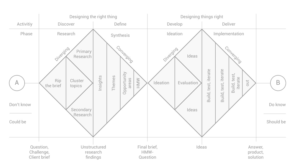
Given the broad scope of our task, I introduced our team to the double diamond model of design thinking. Rather than just rushing into solutions, we wanted to take time to (first) make sure we were solving the right problems (designing for the right thing), and only then figuring out the best solutions (designing things right).
OPTIMIZING FOR WHAT?
Going into the project, we were equipped with two sets of baseline metrics: average security wait time and arbitrary “satisfaction” scores (the funny smiley face buttons). Wait time was fairly black and white (although not entirely so, as I’ll explain later). Satisfaction was a vanity metric though—not something we could actually use in its present form.
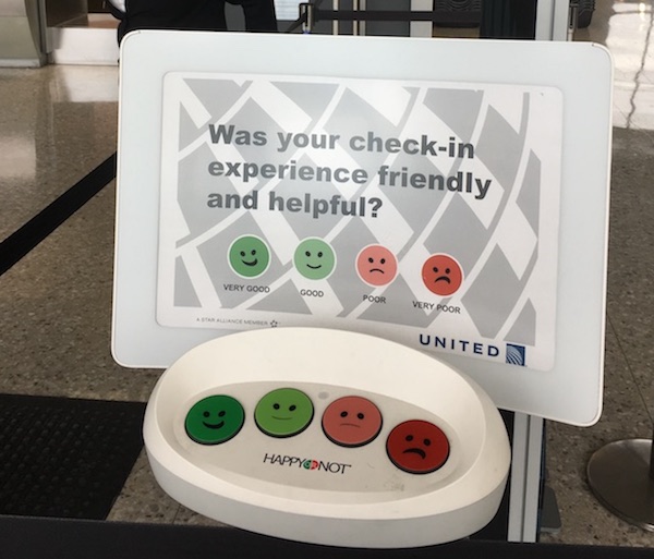
Our first step was to understand what exactly went into a passenger’s “satisfaction.” I suspected that this data only told a (very) small part of the overall story, and upon some investigation we confirmed that, as any designer must be aware of, the way (and place) feedback was collected heavily biased the results.
At Dulles, we found that the feedback stations were only located in two places—upon leaving the check-in counter and upon leaving security. Most of the data was only being collected at the post-security stand, which told us that the data would be closely correlated with wait times (which turned out to be true). This made the dataset of little value to us, and part of my final recommendation was to do away with this form of feedback collection altogether (on which I was ultimately overruled).
In order to determine what we actually would optimize for, we took a two-part approach consisting of passenger interviews and ethnographic observation. The first was perhaps an obvious choice, but it is amazing what one can learn about how an airport (or any setting really) works simply through observation.
***
STRESSORS BECOME AMPLIFIED
After conducting more than 200 passenger interviews at various points of the airport experience (from curbside to gate) and spending hours perched along the main thoroughfares, we saw a clear pattern emerge around pain points to solve for.
1: AIR TRAVEL IS STRESSFUL IN AND OF ITSELF; ANY FRUSTRATION IS COMPOUNDED.
Given the stressful nature of travel, any small inconvenience feels like a much greater one in an airport setting, giving an experience designer little margin for error. This becomes exponential when additional uncontrollable elements like weather delays occur.
2: PASSENGERS HAVE REASONABLE EXPECTATIONS IN REGARDS TO WAIT TIMES, BUT ANY SENSE OF “CHANCE” INDUCES ANXIETY.
While passengers generally understand the need for security checkpoints and don’t mind reasonable wait times, they become anxious when a sense of “chance” exists on how quickly they will get from check-in to gate. Incorporating random reward may be great for prolonging a behavior (as B.F. Skinner’s work on variable ratio schedules taught us), but airport security is not an appropriate venue for such an approach.
3: HAVING TO RUSH THROUGH AIRPORTS CAN LEGITIMATELY BE A SAFETY HAZARD.
Missed flights are costly and inconvenient, which means people will do anything in their power to avoid this. During our observation we saw several near collisions amongst rushing passengers and several other potential medical problems (for example, we frequently saw unfit passengers running with luggage sweating profusely, breathing heavily and seemingly at risk of major medical problems like cardiac arrest).
4: IF YOU SAY IT, MEAN IT.
It is absolutely critical to manage expectations. As alluded to in point #2, passengers understand there will be queues, weather delays, etc. But when information is given, inaccuracy causes great annoyance.
***
WORKING TOWARDS A SOLUTION
Our foundational research gave us clues as to where to look for optimization points, some of which proved to be rather intuitive and others which required more digging. But before actually working towards a solution, I wanted to make sure we agreed to a fixed set of metrics that we would use to evaluate our solutions. We kept average wait time from our baseline, but discarded the generic smiley-face feedback in favor of the following set of metrics:
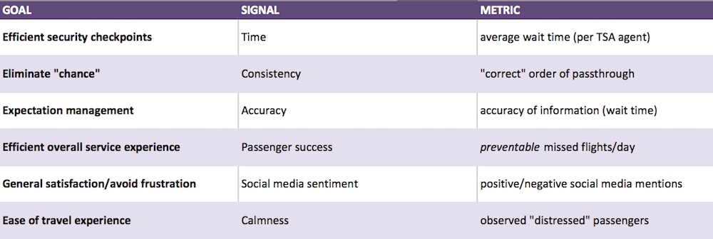
Average wait time: We did not have influence over TSA staffing. As such, we made our metric independent of that, measuring average wait time per agent staffed (at both checkpoints).
“Correct” order of passthrough: As security lines diverged at 2-3 points, we wanted to measure how frequently the “order” of passthrough was correct, meaning first in-first out. To eliminate chance, we aimed to ensure that the order in which one entered security was the same order with which they exited (by premium/economy of course) as frequently as possible.
Accuracy of information: There were signs indicating the security wait time at the entrance to both checkpoints. We wanted to measure the accuracy of these readings at various times of day.
Preventable missed flights/day: Some missed flights would be out of our control—delayed incoming connecting passengers for example. While international inbound-connecting passengers were subject to security screening, we did not incorporate them into our measurements as there were too many other factors that would influence this data (like the timeliness of the inbound flight). For this metric, we considered all IAD-origin departing passengers.
Social media sentiment: Knowing that great or poor experiences often elicit social media mentions, we wanted to observe the general postitive-vs-negative ratio using a sentiment analysis tool.
Distressed passengers: This was a less-scientific metric based on observation (and certainly not 100% accurate). But we wanted to observe for both a month prior to our changes and a month after the number of “distressed” passengers we saw rushing to flights (described above).
***
DESIGN THINKING: WHAT IS, WHAT IF?
Now that we had a working understanding of customer pain points and agreed upon metrics, it was time to start building towards a solution.
In addition to our customer interviews, we also had conducted a comprehensive study on the current curbside-to-gate experience, making a detailed journey map. This included procedures (e.g. check-in, baggage drop, security), physical requirements (e.g. walking, obstacles) and facilitators (e.g. airport train). While we all had some familiarity with the process based on our own travel experiences at IAD, having a documented passenger journey served as an effective assessment of what is.
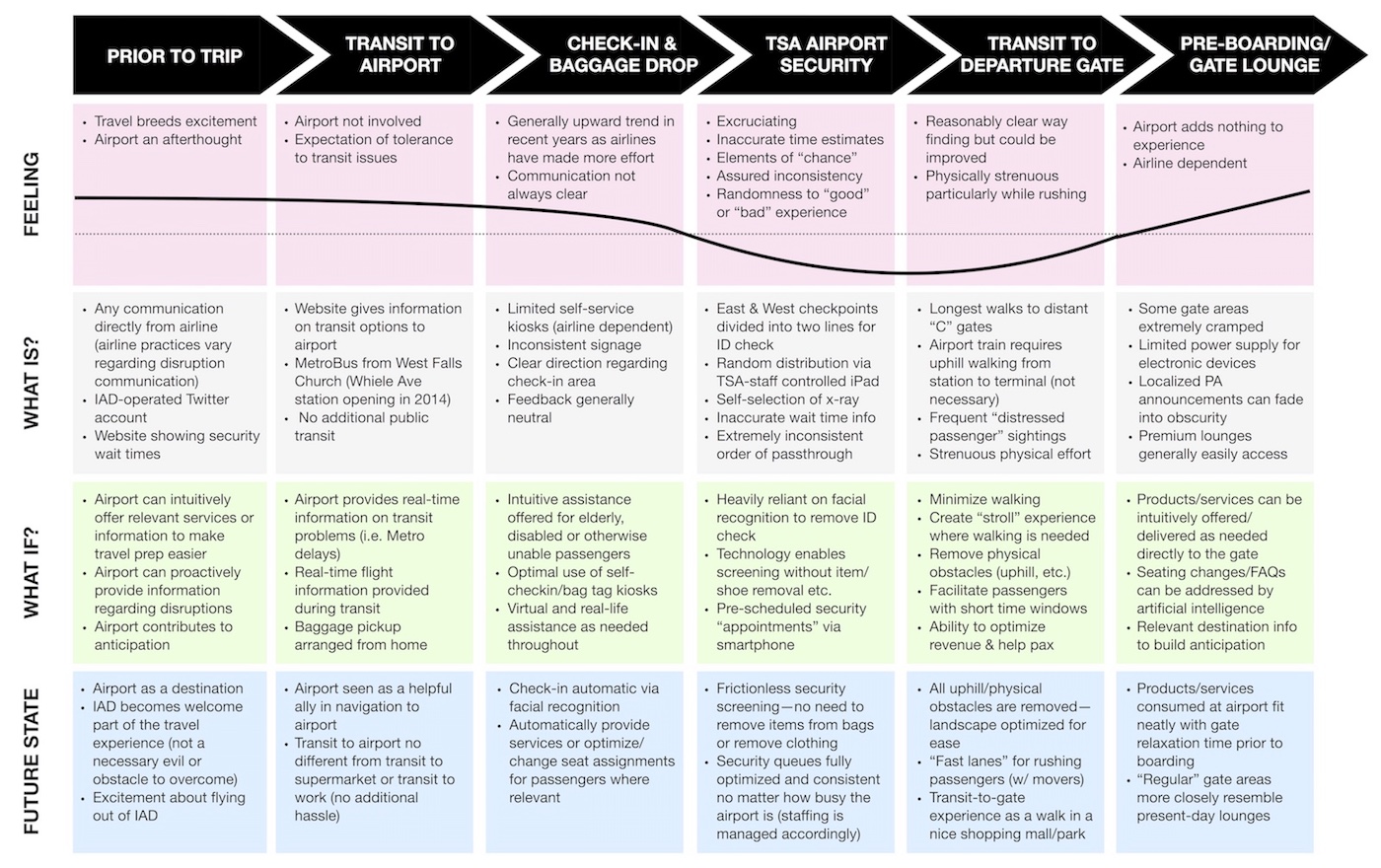
With our interviews and metrics serving as a guide to what we wanted to improve, our next step was to expand our thinking around what if. The idea at this point was to generate an exhaustive list of possibilities that would improve on today’s experiences. Instead of starting with constraints, which can limit creative thinking, we imagined a world with none. Our ideal outcome in this case would have been the ability for a passenger to enter the airport and board their flight without any bottlenecks, without being burdened with heavy bags, and without having to walk more than a few steps (our brainstorms led us to some really interesting research about eye scanning security technology, etc.).
WHAT WORKS
After our exercise in divergent thinking, we came back to a convergent approach and decided which ideas we would test. This was a combination of understanding what was in our (the airport’s) scope as opposed to individual airlines as well as technology we had access to that could be implemented within our time window. We were able to run a series of concept tests in a staged environment with our security recommendation, which helped us make final adjustments to our original ideas.
At this point, we were able to make our final recommendations to the client.
***
THE RECOMMENDATION
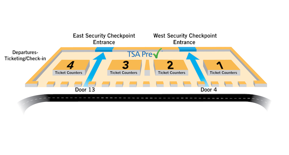
1: BRING ORDER TO SECURITY
Both of IAD’s security checkpoints feature huge mezzanines with up to 16 x-ray stations. In an effort to use the entire space, the airport had set up security as a two-part queue: the first to check boarding passes and ID’s and the second to actually go through the x-rays.

In theory, this seemed fine. But in practice, it facilitated a completely arbitrary process, not just in terms of how long it took to get through security, but also in terms of the order one gets through security in relation to when they entered the queue. There was at least one, up to a maximum of three, times in the entire process where a person who entered the queue later had an opportunity to surpass someone who entered the queue before them.
First, the ushers working the queue, who have no relationship with an airline and are not incentivized in any way to care about people making flights on time, almost arbitrarily opened and closed the stanchions to manage the crowd. This same process continued after ID’s were checked, where an usher guided each passenger into one of the secondary lines to pass the x-ray.
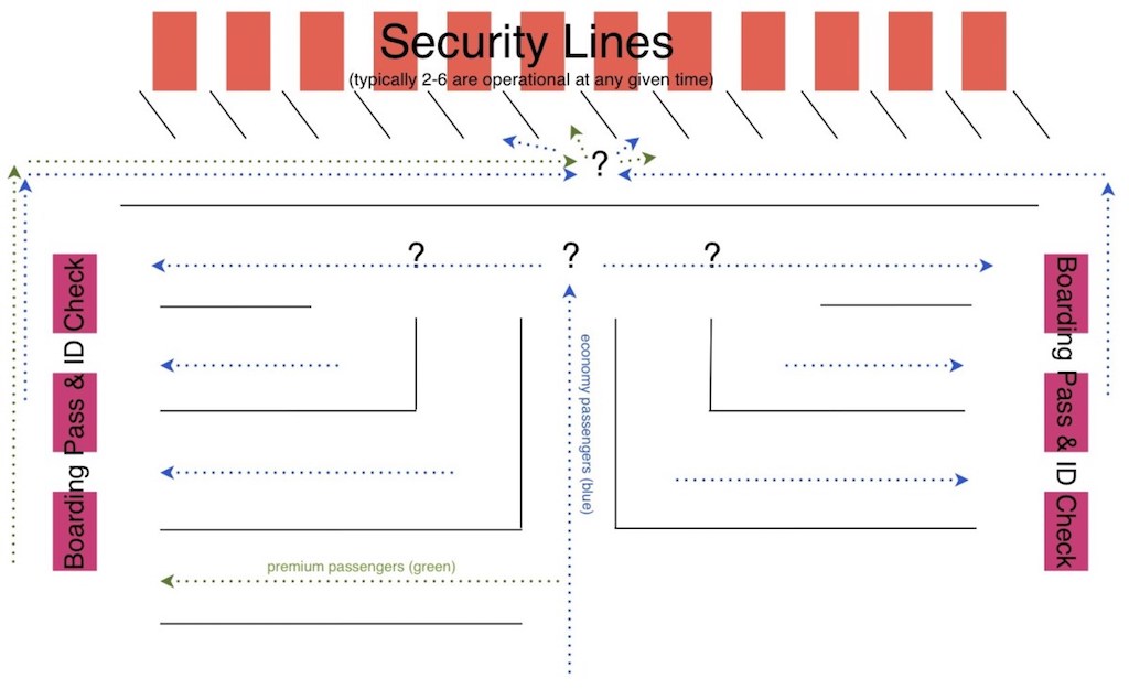
In the diagram above, each question mark represented an element of chance in determining how quickly the person would get through security. (note: this is not an accurate map, as there were several more “snakes” than illustrated here, and also some of the “openings” shown here were randomly opened and closed by ushers. But it illustrates the element of chance that was too much a part of the process).
While well intentioned, nothing is more aggravating as a traveler than being short on time and watching people who entered the queue after you getting through security before you. In fairness, it works in the opposite way as well—sometimes you are lucky on the lucky side—but this should be an orderly process and not a crapshoot. By just having a single queue that funneled to all ID checking stations (we supported having a second queue for premium passengers), we hypothesized that we could still move the line just as fast and remove the randomness. There was nothing wrong with a scenario in which three ID checking stations opened at the same time, and the next three people in queue each proceeded to one. It did not cost any time at all.
Our proposal demonstrated a process involving much less chance and much more consistency:
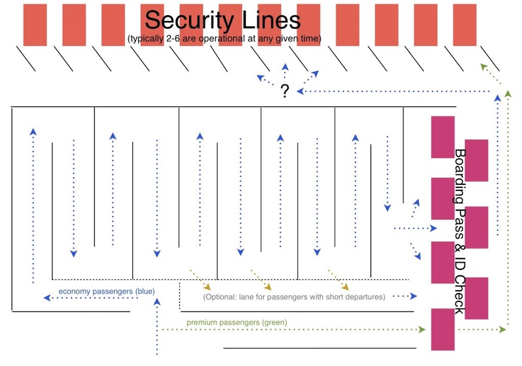
Notice that this same thinking was applied to the second part of the queue, in that you could continue to have a single queue up until the actual tables to start unpacking luggage. Furthermore, having a single queue would make it much easier to accurately predict the time it takes to pass through security based on a quick eye test of where the queue ends, thus helping maintain accurate wait time indications.
One final thought in relation to the security process: A few years prior to this project, there were staffers who would occasionally walk through the line and pull people with quick departure times aside to expedite their security process and help them make their flights on time. I assumed this was taken away due to a lack of staffing, but since learned that it had to do with the arbitrary nature of “allowing” some people to skip the queue. However, the current process still involved staff (as many as 4 or 5 working the security line) and was also still very arbitrary, as explained in this post. So if the staff were still being used, and were empowered to make arbitrary decisions to expedite the flow of the queue (albeit without any incentives), why not allow those with flights departing within, say, 30 minutes, to be allowed to go to the shortest line? This is demonstrated in the proposal in the second diagram above.
Nobody wins by having people miss flights due to being stuck in an inconsistently handled security line. “Get there earlier” is simply not a good enough explanation to busy business travelers who take the same flights on a weekly basis and expect to have a consistent idea of how much time they need to allow before departing to the airport.
2: OPTIMIZE USE OF FACILITIES FOR EASIER TRANSIT
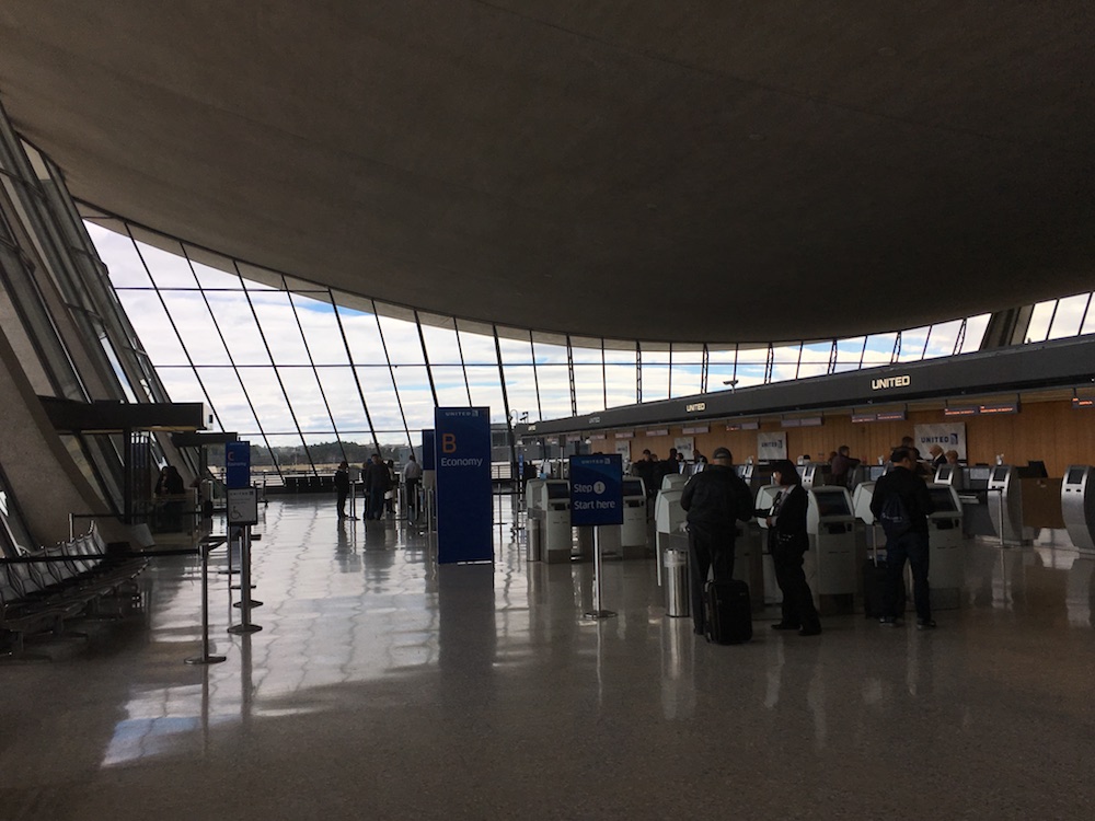
United Airlines was IAD’s largest customer, as the airport serves as one of UA’s primary hubs. The majority of United flights depart from the “C” concourse, which also happens to be the most difficult to get to.
This is because when the AeroTrain system (connecting the main terminal to gate concourses) was opened in 2010, the “C” concourse station was constructed under the site of the future concourse (where it will be built), about 200 meters away from the existing location. With ground having not even been broken (and no commencement in sight), one could rightfully grumble about the decision to create such a long walk for passengers for what promises to be a 10-plus year period, but I will give a pass on this point. However, there was a simple step that could be taken to minimize the pain of using the “C” gates: reverse the flow of the train.
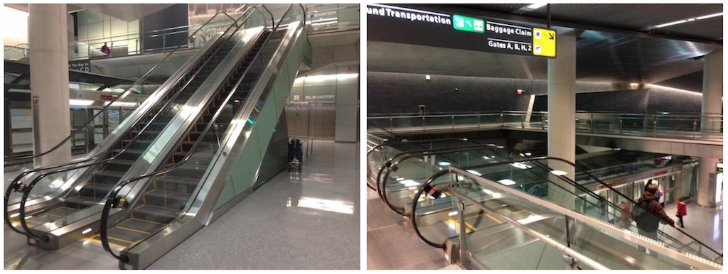
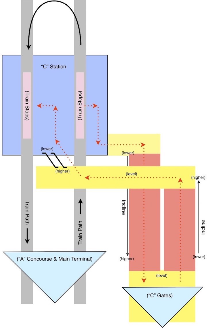
At the time of the project, there were two escalators in the station (pictured above), both of which operated downward. This meant that both passengers going to “C” gates and those coming from “C” gates had to walk uphill. When going to “C” gates, the train entered the station on the right-side platform, the doors opened on the right side, and passengers walked up a fairly steep incline for about 50 meters before the walkway leveled out. When coming from “C” gates, the final 50 meters into the station were also an incline, which then has passengers walk over the track and proceed down the escalators pictured into the waiting area between the two platforms. Both inclines are shown in the image below:
Shown in the figure below, the orange areas represent where passengers had to walk up a significant incline. Yellow areas indicate a level surface. The train from the Main Terminal entered the station on the right-side track, proceeded counter-clockwise and departed towards the Main terminal on the left-side track.
As our ethnographic research showed, about every three minutes, as each new train arrived, a few passengers could be seen running out of the train and up the incline towards “C”, often carrying heavy luggage. Many of these passengers were old, out of shape, or otherwise stressed from the travel process, and the incline was clearly putting more stress on them than necessary. I often thought of the entire walkway as a stroke waiting to happen.
If the process was simply reversed, then passengers in both directions could walk downhill rather than uphill. The train could enter the platform on the same right-hand platform, passengers could disembark on the left, proceed up the double escalators, cross over the track and walk downhill until the hallway levels off. Likewise, those coming from “C” could walk downhill and wait on the outer platform, to enter the right hand doors of the train. If done this way, the passengers would then have to be in the carriage as it goes beyond “C” and turns around, but that was no problem as it didn’t stop again beyond “C” and would not need to stop on the way back through “C”. This is illustrated below.
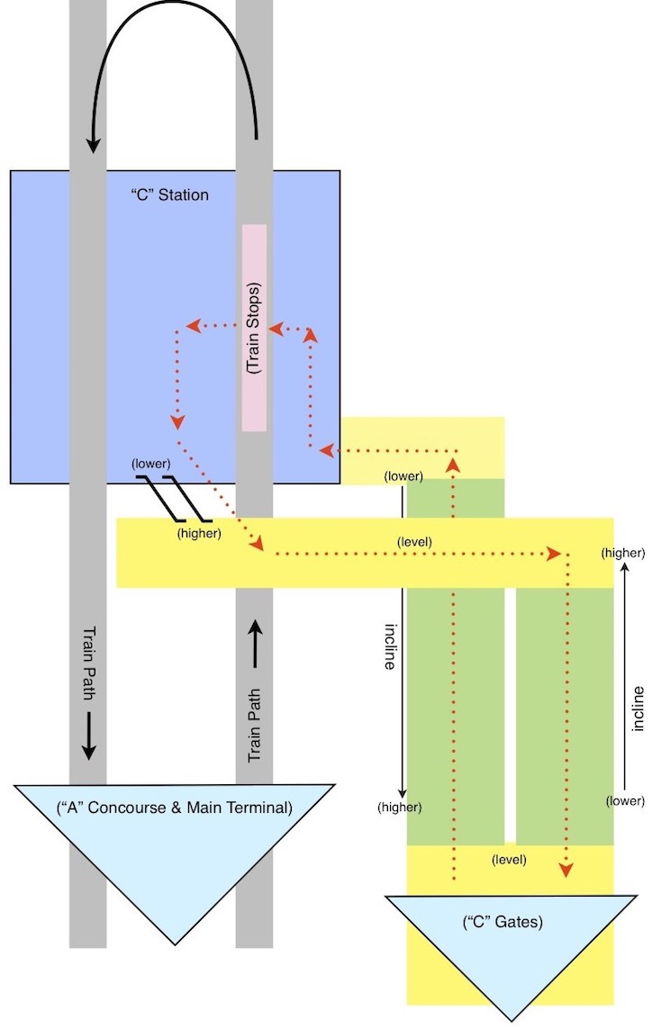
In this figure, green areas represent where passengers could walk down an incline. Yellow indicates a level surface. In this example, the train operated in the same direction as before, but the passengers were directed differently.
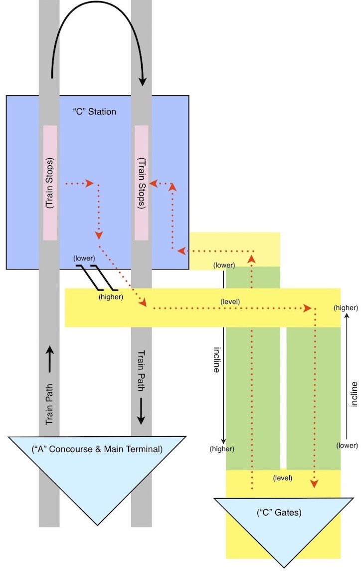
If keeping passengers in the train through the turnaround area was a problem, however, the same end-goal could be accomplished simply by reversing the train (or having the train just reverse direction out of “C” and cross over to the other track going back). This was not a highway—there was no reason the train couldn’t “drive” on the left side. If the train would enter “C” Concourse station on the left-hand platform, the doors could open on the right, passengers could proceed up the escalators, over the opposite track and back down the slope towards the gates. And passengers coming from “C” can wait on the outer right-hand platform (after walking down the other slope), enter the train which is arriving on that platform in the direction of “A” and the Main Terminal, and be whisked away. This is illustrated below, with indicators the same as in the previous figure.
Making this simple change would make walking to “C” gates significantly easier for millions of travelers in the decade until the new concourse was to be built above.
3: MANAGING EXPECTATIONS
One of my favorite design anecdotes is told by behavioral psychologist Rory Sutherland, speaking of the six million pounds Eurostar spent to reduce the train journey from London to Paris by 40 minutes. For 0.01% of this total, they could have put wifi on the trains, which wouldn’t have reduced the length but would have made the time onboard more useful. For 10% of the total, they could have paid the world’s top supermodels to walk up and down the train handing out free champagne; they’d have five million pounds in change and people would ask for the trains to slow down. He tells it with humor, but it shows the real power of psychological solutions to problems, and expectation management is the easiest one of these to get right.
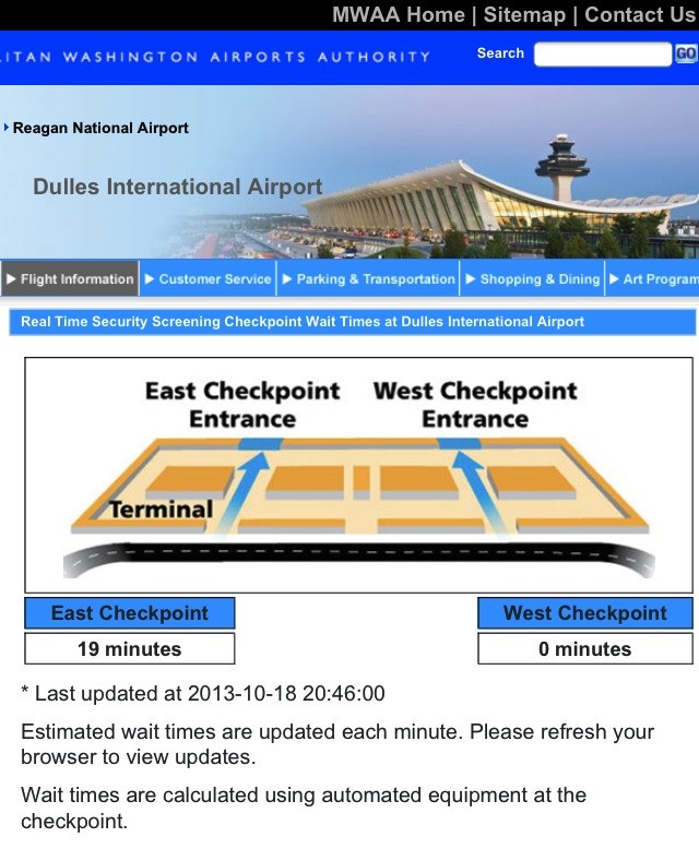
In our ethnographic research, we noticed that the posted security wait times were rarely accurate, and often not even close. We frequently observed passengers waiting between two and three times the posted indicators suggested, which of course is worse than giving no expectation at all.
Our passenger interviews also made us privy to another form of misleading information posted on the airport’s website. At certain operating hours, only one of the main checkpoints is open. When this is the case, we found that the website would show the closed checkpoint as “0 minutes,” rather than specifying that it was closed. While someone who had already been tricked by this would know that “0” is fool’s gold, a first-timer would not, and would certainly choose to go to that security checkpoint.
4: SMART RESOURCE ALLOCATION
While posting the security wait times is a noble attempt to be helpful (never mind the issues that we uncovered), the fact that it is even necessary is to some extent an indicator of poor design.
Every airline flies the same schedule every week out of Dulles, and historical flown data is not difficult to track. It is easy, for example, to analyze that United has X number of seats leaving between 3-6pm, with X% historical load factor for (insert month and day of the week), and that United’s check-in area funnels to the East checkpoint. Furthermore, all airlines are well aware of load factors for a specific day’s flights, and to a great extent, the upcoming few days, making some irregularities possible to prepare for.
By being able to tell which airline check-ins funnel to which checkpoint, when peak days and times are, and when there may be any exceptions to the norm, it should not be difficult to anticipate the rush on each checkpoint and staff them accordingly. If done well, the lines should be similar no matter which checkpoint a passenger chooses.
While expectation management is a step in the right direction, we witnessed several times where one checkpoint said 5 minutes and the other 20 minutes, causing a rush on the shorter side. The result? The 5-minute wait becoming 20 and the 20-minute wait becoming 5 by the very next update. This just wasn’t necessary if staffed accordingly to begin with.
It’s worth mentioning that this was more of an issue for TSA and not wholly within the airport’s control, but we included the suggestion anyway.
5: LITTLE OPERATIONAL DETAILS MATTER
To conclude our recommendations, we pointed out several operational inconsistencies that we observed.
INEFFICIENT TRAIN STOPS
In concourse “C”, for example, the AeroTrain entered the station coming from the Main Terminal on the right-hand platform, and the doors opened to the right to let passengers off. The train then continued on empty, turned around, and re-entered the “C” station on the opposite platform, this time heading towards the Main Terminal.
Despite the fact that nobody was on the train as it entered the station on the way back to Main, and that no passenger can even get to the opposite side of the left-hand track, the doors on the right-side of the train (or far-left part of the blue station in the first two station diagrams above) still opened for a full three seconds before the waiting passengers were allowed to board the train through the opposite doors. What was the need for this? Sure it was “only” three seconds, but over the course of an entire day, that added up to a lot of wasted time.
CONSISTENCY IN GUIDING TOOLS
When walking throughout the airport, it was evident that there were different types of flight information displays in different places. However, the clocks on these displays were never synced. This was a minor detail, but when passengers can miss flights by seconds, it was imperative to have accurate clocks at the airport. (We later learned that they were not maintained from one central hub, which the airport corrected).
***
CONCLUSION
A BETTER DOOR TO THE NATION’S CAPITOL
The Washington Metropolitan Airports Authority implemented our recommendations (with the exception of smart TSA staffing allocation, which was not in their remit to determine) on 01 November 2013. Within weeks we saw measurable improvements in our key metrics, which proved to be consistent over the following three months.
AVERAGE WAIT TIME DECREASED BY 11%
“CORRECT” ORDER OF PASSTHROUGH INCREASED BY 44%
PREVENTABLE MISSED FLIGHTS DECREASED BY 23%
POSITIVE-TO-NEGATIVE SOCIAL SENTIMENT RATIO INCREASED BY 18%
PASSENGER TRAFFIC INCREASED BY 4.5% IN 2014**
**Obviously many other factors outside the scope of this project influence an airport’s passenger figures, but given that we measured this according to aircraft movements/capacity, I believe our work had a significant impact. The 4.5% increase in 2014 was followed up by an 8.1% increase in 2015 and further increases in each year since.