LOCALIZING “SCALE”
Everything Booking does is about scale, which works great when you’re dealing with a homogenous user base. As Booking’s partner base has become exponentially more diverse, a mindset shift was necessary to stay relevant and help all of our partners grow their business on our platform.
I joined Booking to help customize partner experience at scale for the largest online travel portal in the world.
Please note, I have omitted or altered confidential information in this case study. All information is my own and does not reflect the views of Booking.com.
***
EXECUTIVE SUMMARY
This case study examines how I applied a design thinking approach to scale Booking.com’s partner relationship program in a way that would accommodate both our speed of growth and the increasing diversity (both geographically and by industry type) of our partner base.
Our initial research uncovered the increasing shortcomings with our historical approach. It became clear that we had been optimizing for the wrong metrics; looking at open rates and “implementations” in isolation were not actually creating any value. By rethinking how we used data and employing a partner-centric lifecycle view, we were able to introduce new metrics (like time to “achievement”) that inherently aligned what we were optimizing for with the interests of our partners. We also set high-level objectives that would be inclusive and relevant to all partner types rather than thinking about (exclusive) edge cases. With these design principles established, we were able to scale and maintain relevance, and then employ tools to help with necessary customization.
Within four months of launching a fully integrated, channel-agnostic partner relationship program, we saw a 22% decrease in time to first booking, a 14% decrease in partner churn and a 13% increase in net promoter score.
***
INTRODUCTION
In 2012, Booking worked with about 225,000 hotel partners, generating over $5 billion in revenue due to its ruthless focus on online conversion. By the time I joined in late 2016, Booking had nearly 1.5 million accommodation partners, including homes and apartments, and was about to start working with attractions as well.
The company’s “personal” approach to partner management through 180+ local offices was no longer sufficient, and simply quadrupling a sales force wasn’t efficient.
***
THE CHALLENGE
BE PERSONAL AT SCALE
Our goal was to replicate the experience of working personally with our account managers via digital channels. The original premise was simple–have questions answered or troubleshoot problems–but we did not want to stop there. We aimed to build a strong partner foundation that was sensitive to our partners’ rapidly evolving business challenges and increasing diversity.

Our top level goals were the following:
- Ensure that our partners had constant access to any information needed at any time.
- Give partners more control over their business partnership with us.
- Create a platform for innovation and more personal engagement.
***
MY ROLE
I oversaw the strategic design of what we aimed to build. The project kicked off in Q1 2017, and I remained involved until the rollout of a marketing automation platform (Marketo) in Q2 2018.
I worked with a small research team, a content management team (including one graphic designer) and two product owners. They focused on the technical infrastructure while I guided the project from a partner experience standpoint (looking at things like personalization and localization), led generative workshops, uncovered key insights and design opportunities and defined final concepts.
***
KICKOFF
AUDITING OUR EARLY EFFORTS
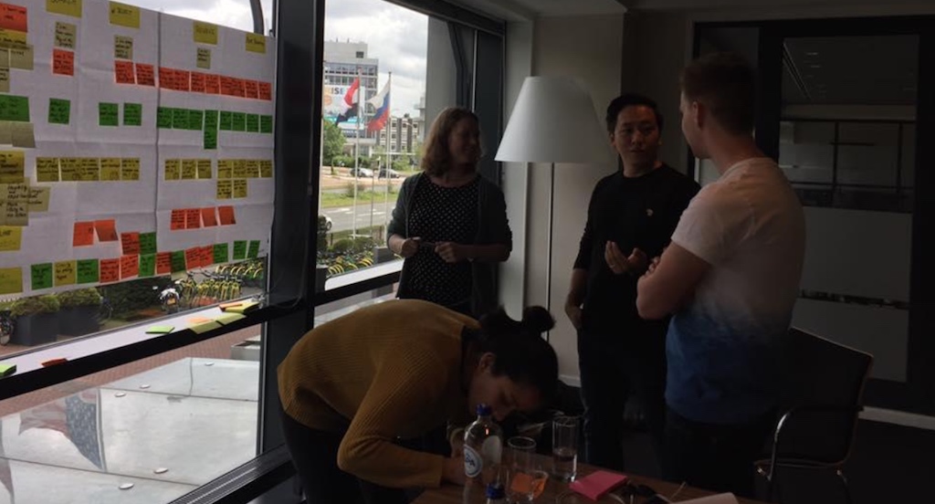
At the outset of my involvement, we had already established some digital communication flow with partners. While we had basic digital analytics in place to determine things like engagement rates, we had little understanding of what partners actually felt about our digital outreach. As such, I started working with our research team to investigate.
***
EARLY INSIGHTS
We set up focus groups with 20 partners in each region consisting of various size hotel partners, home rentals and attractions. Our goals were to understand how they valued our current touchpoints and what they needed from us to work most effectively on our platform.

1: DISENGAGEMENT IS NOT A PROXY FOR ANNOYANCE.
We historically had monitored unsubscribe data to see if outreach efforts were bordering on annoyance. While our unsubscribe rates were low due to factors like mail filters, our focus groups told us that irrelevant communication is in fact annoying.
2: BOOKING’S AUTONOMOUS PRODUCT STRUCTURE CREATES CONFUSION FOR OUR PARTNERS.
A decentralized product structure allows teams to autonomously test with real users and generate quick learnings. However, it also makes for a very disjointed “Booking.com” experience for business partners.
3: TIME-BOXED CONVERSION POSITIVE DOESN’T ALWAYS MEAN LONG TERM GAIN.
Data should certainly inform decision making, but common sense must be applied as well. Our decentralized structure and the subsequent “full ons” it brings due to net-positive tests over a small time window do not necessarily result in better long-term performance.
4: COMMUNICATION SHOULD TAKE AUDIENCE MATURITY INTO ACCOUNT.
Even brand new partners were commonly served with a variety of conflicting “opportunities” that resulted in utter confusion. While mature partners may be able to pick and choose what is important for them, new partners need to be nurtured.
***
THE DISCOVERY
PARTNER EXPECTATIONS CHANGED OVER TIME
Although none were necessarily shocking, I was surprised by the issues we found. I arrived into a culture quite proud of how simple it was to partner with us, and we found that the experience wasn’t necessarily frictionless for partners–perhaps partnering with us was even (gasp!) a necessary evil. After some reflection, it became clear that partners expectations of us evolved over time, and that being a ‘necessary evil’ wouldn’t cut it in the long run.
And if mature, sophisticated hotels were having difficulty understanding us, how much harder would it be for our biggest growth markets (apartment/home rentals & attractions)? Being curious allowed us to see the opportunity we had to remove friction and create delight for our partners, regardless of size, scope or location. This laid the foundation for a working north star.
***
DEEPER INSIGHTS
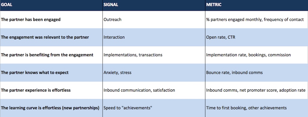
IDENTIFYING THE METRICS THAT MATTER
Before we actually built anything, it was important to define success and understand what made for a successful partner experience at scale.
Prior to undertaking this project, we only looked at rudimentary metrics like open/click rates of partner emails and volume of “inbound” phone calls to our Accommodation Services department.
I introduced the concept of the seamless experience and modeled for the dimensions of time, information and anxiety. I partnered with our data scientist and used this framework to investigate partner experience by region and partner type.
***
MOST INTERACTION WAS NOT DRIVING VALUE
Digging into the data revealed some big insights into the partner experience. First, there was very little correlation between partner engagement and business performance; this means that our outreach efforts were in most cases not valuable to us and certainly not to the partner. Secondly, almost all value-driving product implementations involved some extra coordination effort from the partner. This was hardly the frictionless partnership that we promised.
With the vast majority of our projected growth from partners who will not have access to personal account management, optimizing our digital engagement with partners was of critical importance.
(I have intentionally omitted confidential data here.)
***
WHAT WE NEEDED TO CHANGE
1: OPTIMIZE FOR THE RIGHT METRICS.
Our data-as-king decision making approach may have been winning us individual battles but losing us the war; in other words, scaling various campaigns due to conversion upticks vs. no action resulted in a series of uncoordinated, often conflicting, “to do’s” for partners.
2: AUTONOMOUS TEAMS REQUIRE COORDINATION.
We typically allow teams to work autonomously to be faster to market. As the number of teams working directly with the digital partner experience grew, we found that basic consistency (in regards to look, feel, tone, etc.) was lacking.
3: UNDERSTANDING USER NEEDS.
At virtually no touchpoint did our digital experience reflect a deep understanding of partner pain points. In order to be more successful, we needed to frame products and services in a way that clearly and intuitively solves a problem our audience has.
4: HUMAN TOUCH OR CRUTCH?
The huge investment we made in having human support vis-a-vis our competitors did not always result in a net-positive experience. Impersonal but readily available information was more valuable to partners than personal information with some delay.
***
REFRAMING THE PROBLEM
A DIGITAL RELATIONSHIP SHOULD MIRROR A HUMAN RELATIONSHIP, WITH CONTEXTUAL AWARENESS AND EQ
Our general culture of agility, autonomy and conversion focus helped us become a world leader, but continued growth revealed how this can ultimately result in a negative partner experience. Whether human or digital, communication touchpoints lacking context or understanding were causes of frustration even if that didn’t yet reflect in our bottom line.
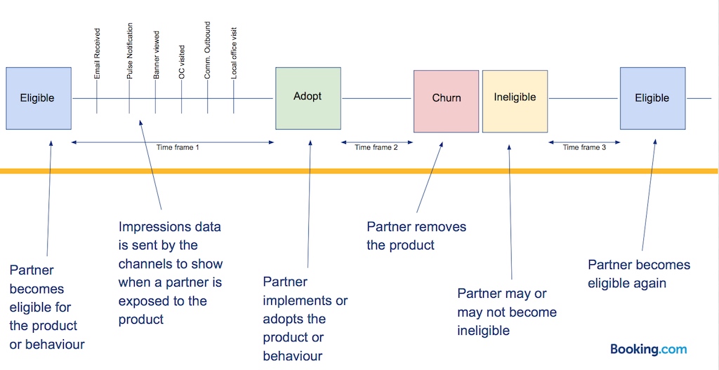
Reflecting on this over a few weeks, it got us to asking how we might incorporate contextual awareness into every touch point and interaction with a partner? We set out to redesign our entire digital partner experience from the outside in.

The above diagrams show how we previously had considered lifecycle only from our perspective. We had to reconsider that into the partner-centric perspective below:

***
INTRODUCING “CHEF”
In an age of digital clutter, we aimed to differentiate our partner experience by making sure every interaction was valuable to our audience. Our goal was to make sensible decisions for our partners, informing them clearly in ways that are understandable and actionable.
We developed a data framework (called “CHEF”) that recorded every partner interaction, both human and digital, and fed that into a predictive analytics mechanism to determine “next best action” for the partner and ensure data was shared across touchpoints.
YOU HAVE PROBLEMS, WE HAVE SOLUTIONS
Every product and service offering would be tied to a clearly defined and data-backed partner need and positioned as a solution to that problem. No more salesy interactions.
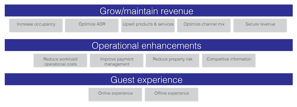
COMMUNICATION LINKED WITH REAL-TIME BUSINESS PERFORMANCE
For new partners, we developed a comprehensive onboarding program that was contextually linked to actual partner “achievements.” Partners who were quickly opening and receiving traffic & bookings would now have a very different experience from partners who were a bit slower, in terms of message, tone and personal touch.
REDEPLOYING THE HUMAN CHANNEL
In order to make sure our experience was holistic, we also had to redefine how we typically employed our account managers. Historically always prioritizing based on partner business volume, we introduced a new structure whereby account manager actions/calls were prioritized according to an algorithm factoring in contextual cues and partner needs in addition to transaction potential.
***
HOW WE GOT THERE
A PLEASANT, COHERENT EXPERIENCE FOR EVERYONE, EVERYWHERE
Three primary questions informed my design strategy:
- How do you design for everyone, everywhere?
- What nuanced contexts do diverse partner types create?
- How do you define pleasant and coherent?
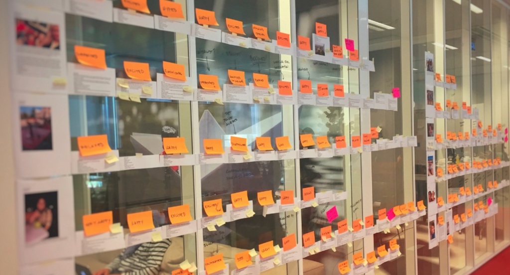
Early on, it was critical to understand the different factors that influence the partner experience. I mapped all possible concepts and translated this into the scopes & conditions framework.
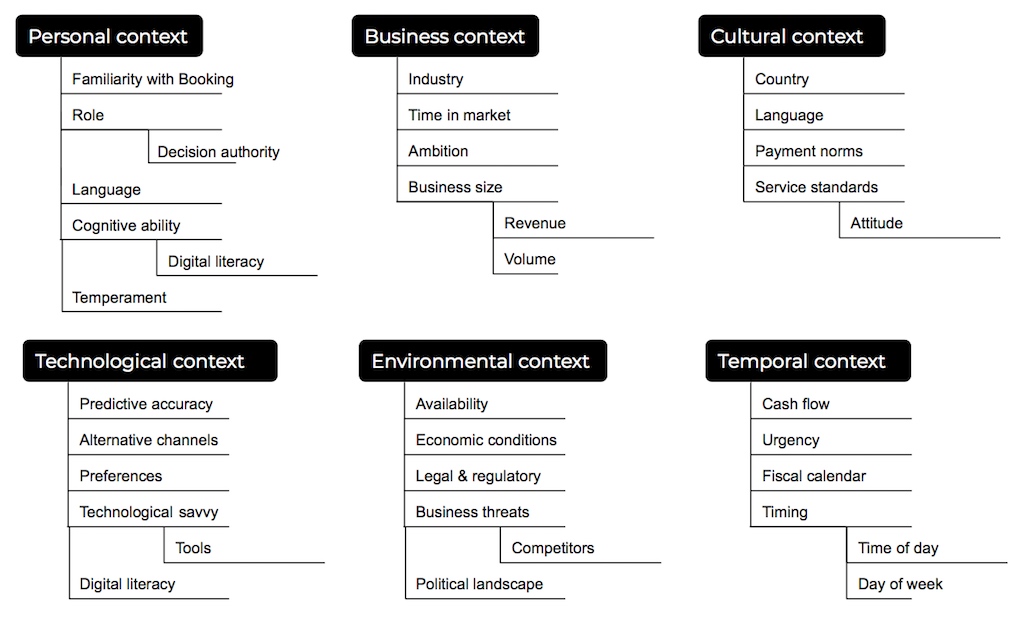
A MORE COHESIVE EXPERIENCE
The existing partner experience was poorly designed for users who were not large hotels that have a Booking account manager on speed dial. To move beyond the existing biases and outdated assumptions, I challenged my team to think about what designing for everyone, everywhere meant.
The scopes attempt to highlight the range of temporary or permanent challenges to consider when a person is interacting with Booking.
The conditions attempt to highlight situational challenges that everyone experiences. This is temporary and contextual, but can have a lasting impact on what users think about their relationship with us.
“We realized that Booking poorly empathized with users who weren’t reflections of our biggest and most legacy partners, typically located in Western Europe.”
This framing was used to chip away at any stereotypes the team had about our partners. We aimed to design scalable solutions that apply to any combination of contexts we identified throughout the process.
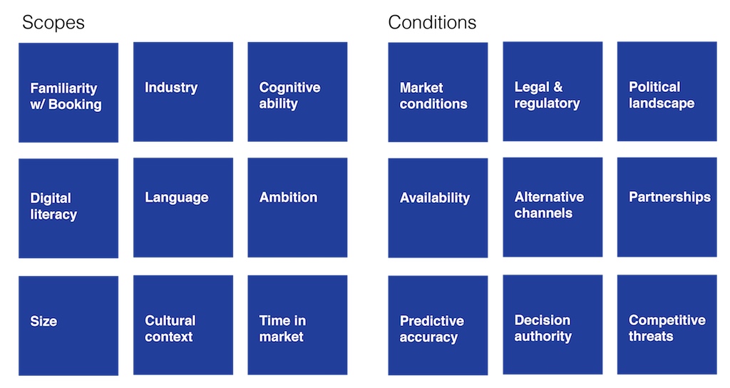
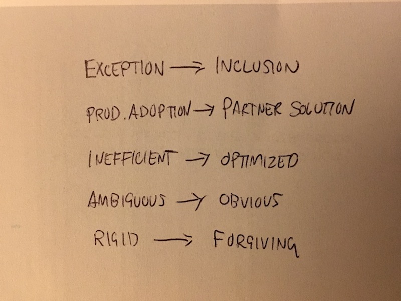
EXCEPTION TO INCLUSION
I created an additional hierarchy of needs framework to reframe our digital conversations about quality and features.
Instead of starting with a legacy-centric design and making exceptions for what the team had thought of as other challenging partner types (or edge cases), we wanted to start with a minimum quality bar for all partner types and contexts.
This framework helped us move beyond unproductive questions like “what exceptions do we need to make for attraction partners?” to “how might we design a partner-centric program that is industry agnostic?”
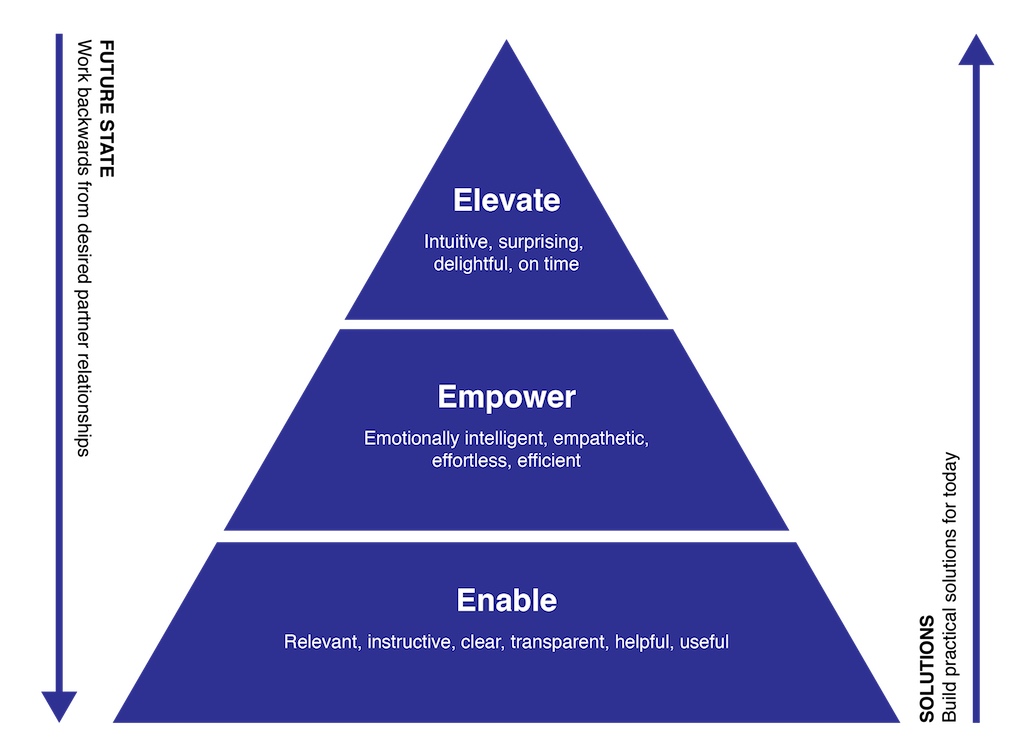
WORKING BACKWARDS FROM PERFECT
I reversed the polarity of the fractured experience to jumpstart creativity, spawning four critical design challenges:
- How might we better relate our communication to real-time problems a partner is facing?
- How might we leverage our human and digital resources to save partner time?
- How might we remove the need for human interaction entirely?
- How might we better adapt to changing business contexts and human mistakes?
***
FROM PRODUCT ADOPTION TO PARTNER SOLUTION
BETTER UNDERSTANDING OUR PARTNERS DAY-TO-DAY LIVES
A major cause of partner frustration and “inbound” was a general lack of empathy for daily pressures. Outreach that is not contextually intelligent runs the risk of damaging a relationship more than taking no action at all.
Our data revealed that:
- 50% of product marketing communications were not clearly understood.
- Learning of products that were not easy to understand created mental and emotional workload for partners.
- 60% of “Extranet” sessions offer clear insight into what a partner will attempt next. We did nothing with this information.
Based on these insights, I proposed our Problems Framework, building on these key themes:
- Every product we offer is grouped according to partner problem it solves.
- Leverage available contextual information as much as possible.
- Integrate all available information into decision trees for “next best action.”
STARTING AT THE BOTTOM LINE
In order to optimize the partner experience, we had to understand one critical concept–what does the partner expect at any given time?
We agreed that framing every outreach according to a real-time problem a partner had, tipped by leveraging the contextual data available to us, would be most empathetic to the partner. It also proved to unlock other underlying benefits, like demonstrating the value of partnering with us and its impact or potential impact on a partner’s bottom line.
Within our partner Extranet, I designed a shortcuts feature–predictive links to relevant information. This represented a significant design shift to empathize with our user, as the premise shifted from set your account features to set your account goals.
MITIGATING RISK
Making changes to the core way our partners conduct business with us came with some level of risk, and we wanted to avoid friction that change brings.
To de-risk some of our assumptions, we visited partners in London and Hong Kong to test early prototypes of our accelerated Extranet. Surprisingly, not a single focus group participant seemed confused by the new navigation, and the shortcuts were well-received. Designing for speed was confirmed to be a solid goal.
INSPIRING CONFIDENCE WITHOUT INTERVENTION
If the new experience was to carry weight on behalf of our partner, we had to make sure that she or he was comfortable with the decisions being made.
Thinking about how much emphasis should be given to this wondering state was new to us, not something previously considered, and an important decision.
Our earliest prototypes designed in a high-risk manner, choosing to limit the range of choices available to the partner online. We thought that by demonstrating a clear understanding of the partner’s need at any given time we could strengthen other areas of our partnership. Rather than worry about what actions they needed to take, partners could focus on what they wanted to achieve and we would take care of the rest.
KNOWING OUR AUDIENCE
The goal of this design approach was to guide the partner into a next-best action in order to have the most success working with us. I assumed that ease-of-use and bottom line were key to being frictionless. After testing several iterations, we found that:
- Less control resulted in more stress at times.
- Partners assumed we would recommend “next best” steps anyway without taking control away from them.
This approach ultimately proved to be overly aggressive, as our partner base was not like our more passive user base. These were business professionals who wanted to be in control of their choices at all times, and our prototyping helped us learn this quickly and at minimum cost.
After these iterations, I killed the shortcuts approach in favor of directional cues gently guiding users based on predictive analytics unique to them. By taking a singular view of a partner across channels, we were able to make sure that data is transferred across touchpoints to get this experience right in nearly all cases.
Additionally, we incorporated the partner solution framework into all digital push communications (primarily our email channel), making sure that every product was framed in the context of a real-world problem it solves for our user.
***
FROM INEFFICIENT TO OPTIMIZED
LEVERAGING OUR RESOURCES FOR OPTIMUM IMPACT
Having integrated data across touchpoints and framing communication around easy-to-understand problem solutions allowed us to do most of the heavy lifting in servicing our partners. But we needed to design our partner relationship program to not only work when it can, but also to be intelligent enough to understand when it couldn’t–when did we need some of our human channel to intervene? This concept of adaptation was complex and a different way of thinking for our business.
Core to this adaptation framework were the following concepts:
- A confidence score would determine whether our digital programs were effective at an individual partner level. How we calculated this confidence score would be subject to incessant review and optimization.
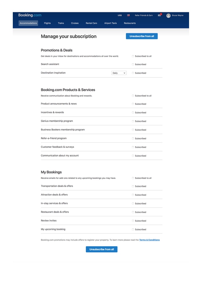
- We needed to respect partner control and agency. Design patterns needed to allow for opting in, opting out or taking complete control.
- The system needed to be flexible enough to learn about partner preferences. Whatever assumptions we made could never be set in stone.
INTELLIGENT INTERVENTION
In order to leverage our team of account managers according to the above, we needed to move beyond allocation based on partner size to allocation based on partner need. This presented several design challenges:
- Understanding where human access was critical to a partnership.
- Adapting when we do not know a partner’s status.
- Creating heuristics to indicate when intervention was or wasn’t possible (expectation management).
- Balancing intelligent defaults with choice and control.
ADAPTATION: A FLEXIBLE ARCHITECTURE
I established the flow based on our partner confidence score. If the system was confident that an account was being taken care of sufficiently, it did all of the heavy lifting. Otherwise, our account team would be prompted when intervention was necessary.
Instead of designing for the right answer rigidly around every possibility, I designed a flexible system optimized for learning and optionality.
***
FROM AMBIGUOUS TO OBVIOUS/RIGID TO FORGIVING
COMMUNICATING IN A MORE INTUITIVE WAY
A critical part of our scalable partner experience is that partners have a clear understanding of what steps they should be taking at any given time. Our previous digital touchpoints didn’t do a good enough job of taking contextual clues into account.
During our research trips and in meetings locally with different partner types, we observed vastly different learning curves. Some partners intuitively understood how to partner with us quickly, while others took much longer. Our onboarding programs, however, didn’t account for any of this information.
We found that by simply letting different data sets talk with each other, we could dramatically shorten the learning curve until partners were fully up-to-speed with us. This prompted us to overhaul our onboarding process.
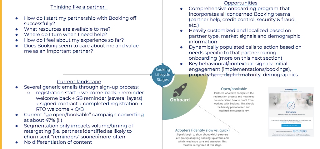
In being consistent with our overall themes for this project, we wanted to recreate our onboarding program to be less about Booking and more about the partner. As such, I looked to mirror what was important to us with what was important to a partner.
I started out by creating a concept model for understanding when partners reached an “achievement” or milestone. The exercise helped me come up with the idea that cognition of various value-inducing concepts for us could potentially be correlated to hard achievements a partner was reaching.
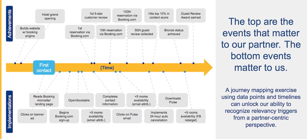
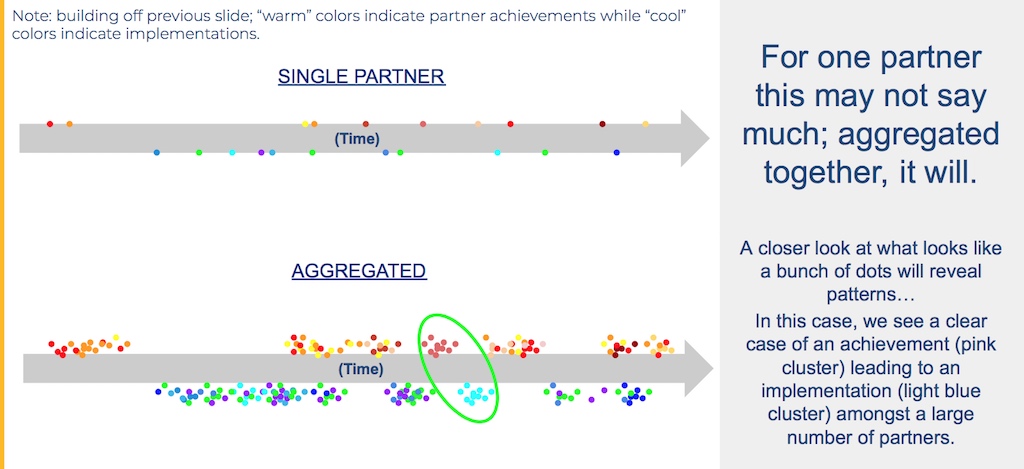
When aggregating this data, some clear cues emerged. In many cases, it became clear exactly when a partner achievements would lead directly to a product adoption for us, which greatly informed our push marketing efforts going forward.
***
THE LAUNCH
A FULLY INTEGRATED, OPTIMIZED AND CHANNEL-AGNOSTIC PARTNER RELATIONSHIP PROGRAM
The result of our 18 months was a reframing of our digital outreach programs, a redeployment of our 12,000 human account managers, and a complete integration of partner data across channels to optimize partner-centric, confusion-free relationships at scale.
***
THE IMPACT
POSITIVE RESULTS AND CONSTANT IMPROVEMENT
The redesign of our partner relationship program through our Extranet, cross-channel digital outreach programs and via our human channels has had a positive impact on our partnerships (at the time of writing, 3.5 months since launch). However, “inbound” rate has not been significantly reduced, which means that partners are still finding the need to reach out to our human channels. I predict this will be a behavior change that will reveal over a longer period of time, as our predictive analytics become stronger with more historical data to build from.
TIME TO FIRST BOOKING REDUCED BY 22%
PARTNER CHURN REDUCED BY 14%
NET PROMOTER SCORE INCREASED BY 13%
“INBOUND” RATES DECREASED BY 2.8%
(For confidentiality reasons I have omitted the actual values for these metrics.)
